Motion Guide
Motion Design Guideline
Motion design is a combination of visual medias; graphic design, animation and audio. In eFishery, photography and texts are the 2 main elements in delivering messages through motion graphic.Here are the main principles of designing eFishery’s motion graphic:
1. Simple & Smooth
- Simple movement to highlight the message
- Avoid too bouncy animation
2. Dynamic
- Avoid stillnes and long pauses. Rather use slow zoom in/out or camera panning on scenes that needs little to no movements.
3. Consistency
- Consistency on every fade in and fade out animation
- Consistent easing-curves and timing
eFishery Bumper (White)
Logo Animation
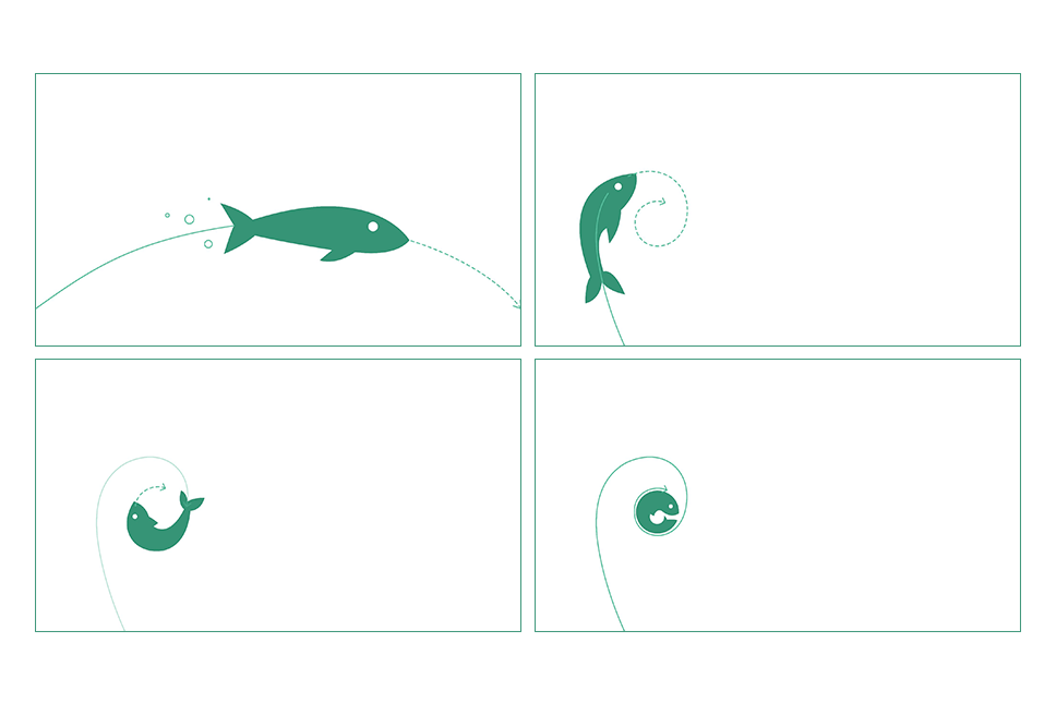
Consists of 2 elements, logomark and logotype.Logomark
1. Simplified fish icon
2. The icon transforms clockwise into eFishery logotype
3. Visual effect as complementary to the main animation.
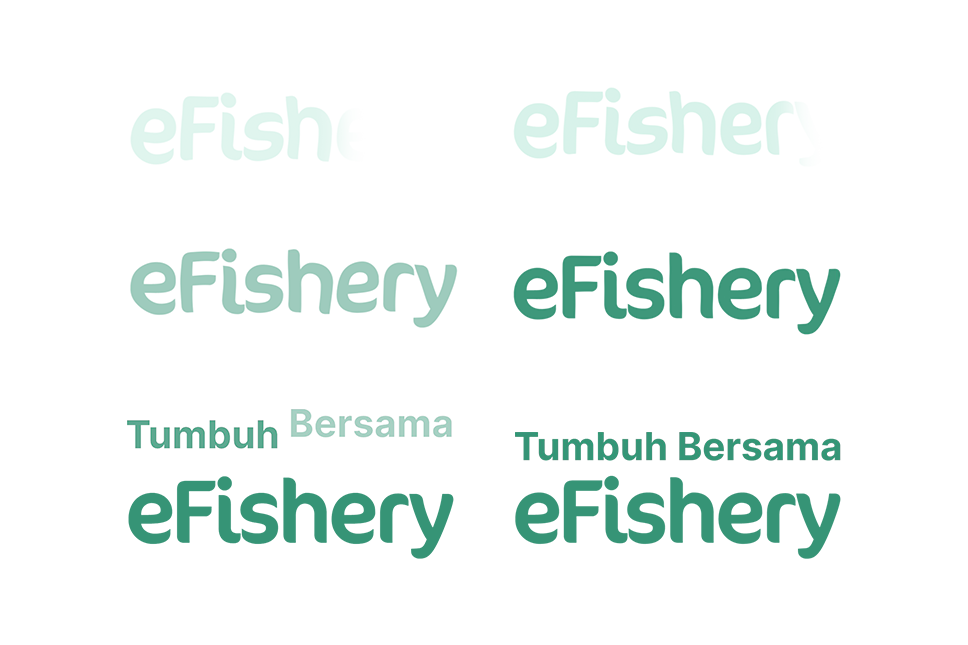
Logotype
1. Logo type fade in (left to right)
2. Liquid effect on fade in
3. Animate- in tagline (optional)
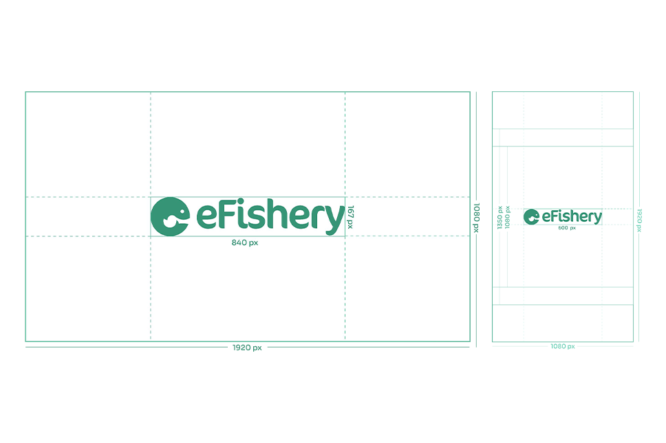
Logo Animation
Final composition
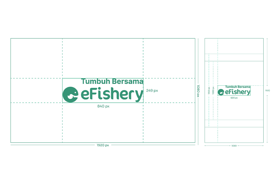
Logo Animation With Tagline
Final composition
Logo Do’s and Dont’s
Logo Animation
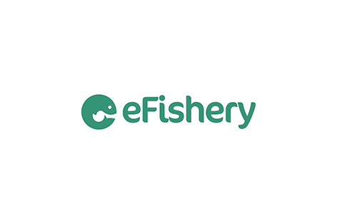
Primary colour in white BG
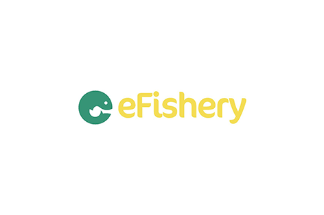
Changing the colour
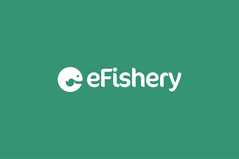
White logo on coloured BG
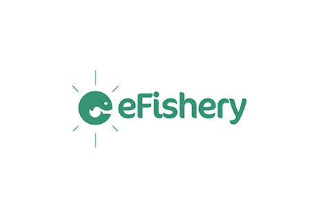
White logo on coloured BG

White logo on dark image background
Streching the logo

White logo on light image background

Blending (multiply, screen, overlay, etc)
Logo Animation with tagline

Primary colour in white BG
Changing the colour

White logo on coloured BG
White logo on coloured BG
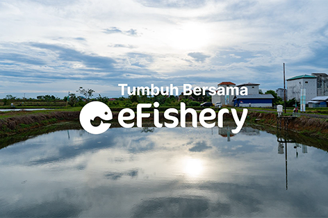
White logo on dark image background
Streching the logo

White logo on light image background
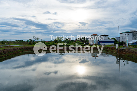
Blending (multiply, screen, overlay, etc)