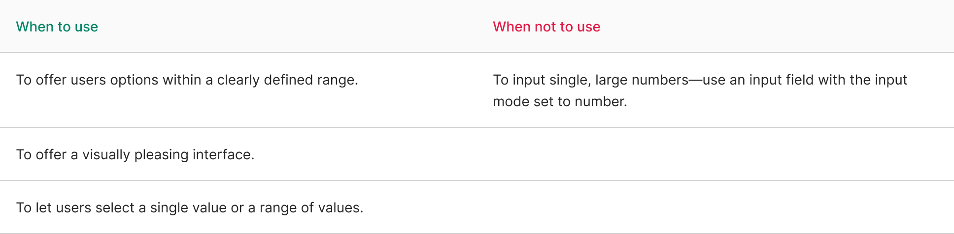
Slider
A slider is a user interface component that allows users to select a value or a range of values from a continuous or discrete set by dragging a handle along a track. It provides an interactive way to choose a value within a specified range, typically by sliding a visual indicator horizontally or vertically.
Variant
Here are some types of slider, including:

Anatomy

- Min value
- Slider
- Mark
- Handle
- Max value
- Value
Usage
Key characteristics of sliders include:
- Value Selection: Users can drag the slider handle along a track to choose a specific value within a predefined range. The selected value is often displayed in real-time as the slider handle moves.
- Continuous or Discrete Values: Sliders can offer continuous ranges (e.g., adjusting volume or brightness) or discrete values (e.g., selecting from a list of predefined values).
- Visual Feedback: They provide visual feedback, indicating the current selected value through the position of the handle or a corresponding numeric value displayed alongside the slider.
- Customizable Range: Sliders can have customizable minimum and maximum values, enabling designers to define the range within which users can select.
- User Interaction: Users interact with sliders by clicking and dragging the handle or by tapping and sliding on touch-enabled devices.
- Application: They are commonly used in settings panels, control panels, multimedia applications, and any scenario where users need to select a value within a range.
- Accessibility: Design considerations such as adequate contrast, clear labels, and sufficient touch target size are important for ensuring sliders are accessible to all users.
Sliders offer an intuitive and interactive way for users to select values within a range, allowing for precise adjustments and interactions in various applications and interfaces. They provide a visual and tactile method of input, making them a versatile component in user interfaces.
Behavior
Present immediate feedback
Users often expect instant feedback when using sliders, as seen in volume controls on various devices or video players. It’s crucial to ensure that users can witness the impact of their selected range.
Utilize histograms to aid in this process by providing a visual representation of the content encompassed within the selected range. However, ensure that this information is also accessible through non-visual means for inclusivity.
Use for appropriate ranges
Sliders are effective for a wide range of values, yet their efficacy diminishes when the range is either too vast (e.g., 0 to 1,000 in increments of 1) or too limited (e.g., 0 to 3).
To address large ranges, consider breaking them into smaller segments or allowing users to step through the range in larger increments. For smaller ranges, checkboxes or selects could be more suitable alternatives.
Hide on small screens
To accommodate a slider in a confined space on a screen, consider initially concealing it behind a button. Popovers serve as a useful way to reveal sliders effectively in such cases.
Make range clear
When presenting a range for selection, ensure clarity regarding the minimum and maximum values. The value description is an ideal space to convey this information clearly without overwhelming the user.
Content
Use labels
Labels play a crucial role in clearly indicating expectations. They are vital for users who rely less on visual cues and assist everyone in understanding what information is required. Opt for concise and descriptive phrases, preferably nouns, to ensure clarity in the request. You can find examples of effective form labels in our form label patterns.
import React, { useState } from 'react';
import { Slider, Switch } from 'antd';

const App: React.FC = () => {
  const [disabled, setDisabled] = useState(false);

  const onChange = (checked: boolean) => {
    setDisabled(checked);
  };

  return (
    <>
      <Slider defaultValue={30} disabled={disabled} />
      <Slider range defaultValue={[20, 50]} disabled={disabled} />
      Disabled: <Switch size="small" checked={disabled} onChange={onChange} />
    </>
  );
};

export default App;