Skeleton
A skeleton screen, also known as a skeleton UI or skeleton placeholder, is a visual representation used in user interfaces to indicate that content is loading or to provide a preview of where content will appear. It serves as a temporary placeholder that mimics the layout and structure of the expected content before the actual content is loaded or when content doesn't exist yet.
Variant
Here are some types of skeleton, including:

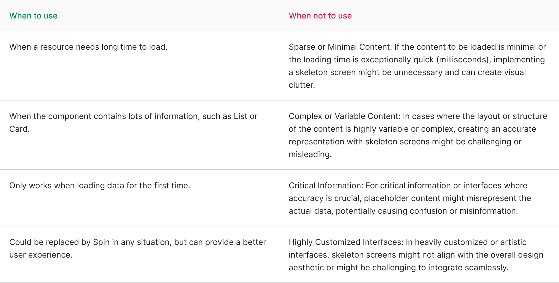
Usage
Key characteristics of skeleton screens include:
- Visual Structure: They outline the layout of the content, displaying shapes, lines, or placeholders resembling the expected content’s structure. These placeholders represent where images, text, or other media will appear.
- Indication of Loading: Skeleton screens are commonly used during loading times to indicate that content is being fetched or processed. Instead of leaving blank spaces or showing a loading spinner, they give users a visual cue that content is on its way.
- User Expectation: Skeleton screens manage user expectations by providing a sense of continuity in the interface, reducing the perception of latency or delay, and making the loading process appear smoother.
- Improving Perceived Performance: They create an illusion of faster loading times by giving the impression that something is happening on the screen, even before the actual content loads.
- Consistency with Design: Skeleton screens maintain consistency with the overall design language of the application, ensuring that the placeholders align with the styling and layout of the actual content.
- Temporary Placeholder: When content is expected but hasn’t been generated or populated yet, skeleton screens offer placeholders that suggest where the content will eventually appear.\
Skeleton screens are an effective design strategy to enhance user experience during loading times, reducing perceived wait times, and ensuring users feel engaged even when content retrieval or processing takes a little longer.
Behavior
Default
The Skeleton component typically contains a single row by default. However, you have the option to modify the number of rows, adjust their height, and set the spacing between them. This functionality proves beneficial when aligning the component’s appearance with the expected height of the forthcoming data.
import React from 'react';
import { Select } from 'antd';

const handleChange = (value: string) => {
  console.log(`selected ${value}`);
};

const App: React.FC = () => (
  <Select
    defaultValue="lucy"
    style={{ width: 120 }}
    onChange={handleChange}
    options={[
      { value: 'jack', label: 'Jack' },
      { value: 'lucy', label: 'Lucy' },
      { value: 'Yiminghe', label: 'yiminghe' },
      { value: 'disabled', label: 'Disabled', disabled: true },
    ]}
  />
);

export default App;