Segmented
Segmented controls are a user interface element that allows users to choose between multiple, usually two or more, distinct options. They typically appear as a series of individual segments, each representing a separate choice or category. Users can select one option from the available segments, and unlike segmented buttons, segmented controls allow for multiple selections.
Variant
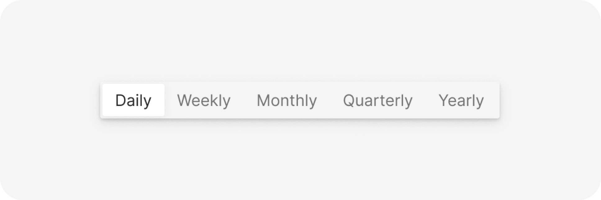
Here are some types of segemented, including:
Anatomy
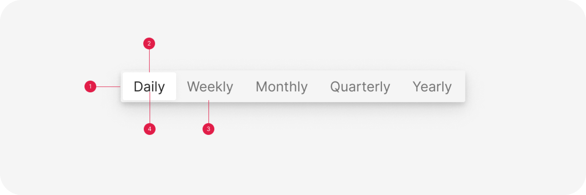
- Container
- Selected
- Unselected
- Label
Usage
Key characteristics of segmented controls include:
- Distinct Segments: Each segment within the control represents a separate option or category. These segments are visually distinct, often separated by visible boundaries or spacing.
- Multiple Selections: Unlike radio buttons where only one option can be selected at a time, segmented controls permit users to choose multiple segments simultaneously.
- Clear Visualization: The selected segments are visually highlighted, often by a change in color or a raised appearance, to indicate which options are currently active or chosen.
- Usage in Settings or Filters: Segmented controls are commonly used in settings, filters, or navigation elements, offering users a clear and direct way to toggle between different options or categories.
- Compact Layout: They provide a space-efficient method of displaying multiple choices without overwhelming the interface, particularly useful in mobile apps or settings panels.
- Immediate Feedback: Segmented controls usually provide immediate feedback as users interact with them, displaying the selected options instantly.
- Consistency and Familiarity: They offer a consistent and recognizable design pattern across various platforms, ensuring familiarity for users across different interfaces.
Segmented controls serve as a flexible UI element for allowing users to switch between multiple options or categories, offering a clear and compact method of interaction in various applications and settings. Their ability to accommodate multiple selections distinguishes them from single-selection components like radio buttons or checkboxes.
Behavior
The SegmentedSwitch currently supports up to two segments, each clearly divided and labeled. One segment can be set as checked by default using the ‘defaultCheck’ property. It also accommodates Help and Error states, offering additional user information. Tab navigation mirrors that of radio input elements, with the first element selected by Tab and switching between elements with arrow keys.
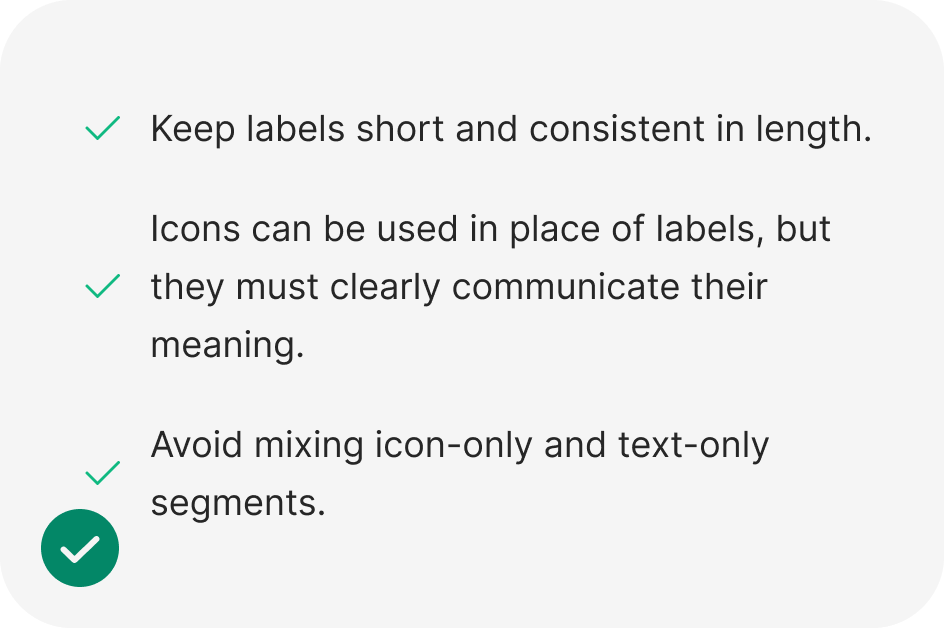
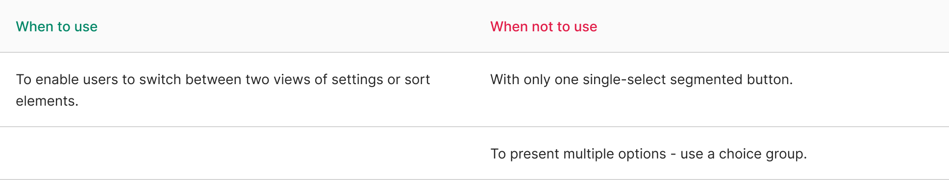
Do
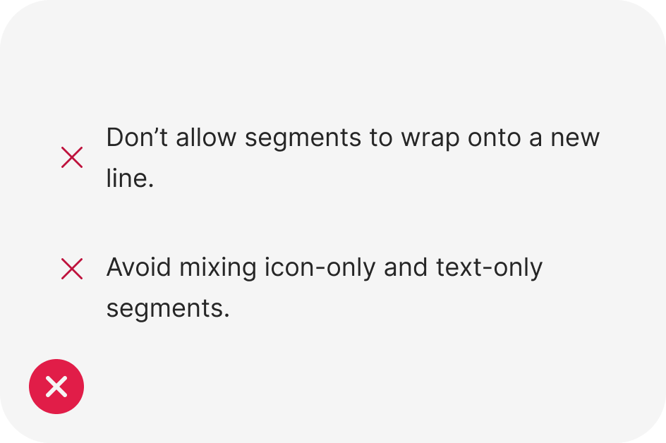
Dont
import React from 'react';
import { Segmented } from 'antd';

const Demo: React.FC = () => (
  <Segmented<string>
    options={['Daily', 'Weekly', 'Monthly', 'Quarterly', 'Yearly']}
    onChange={(value) => {
      console.log(value); // string
    }}
  />
);

export default Demo;