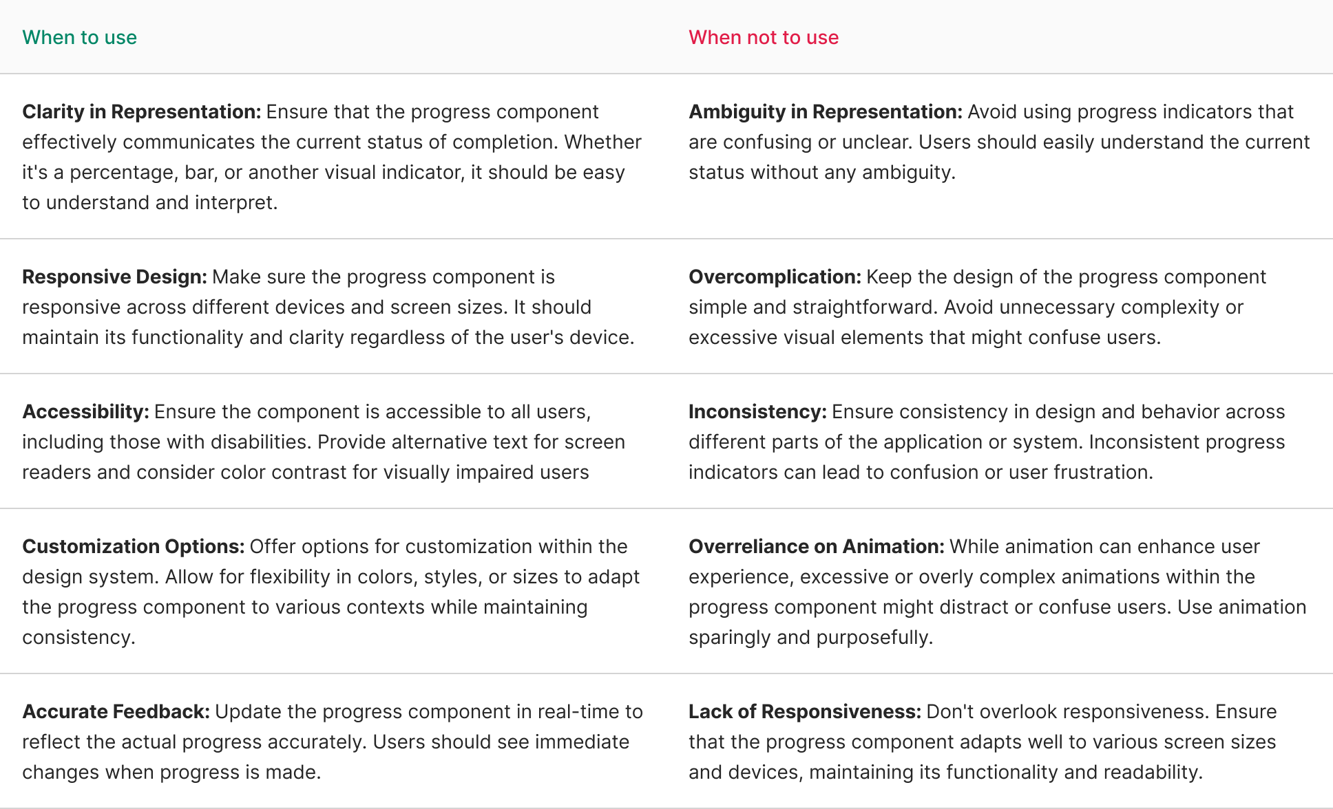
Progress
A progress component is a visual element within a design system used to indicate the status or completion level of a task, process, or workflow. It provides users with a clear visual representation of how far along they are in a particular process.
Variant
Here are some types of progress, including:
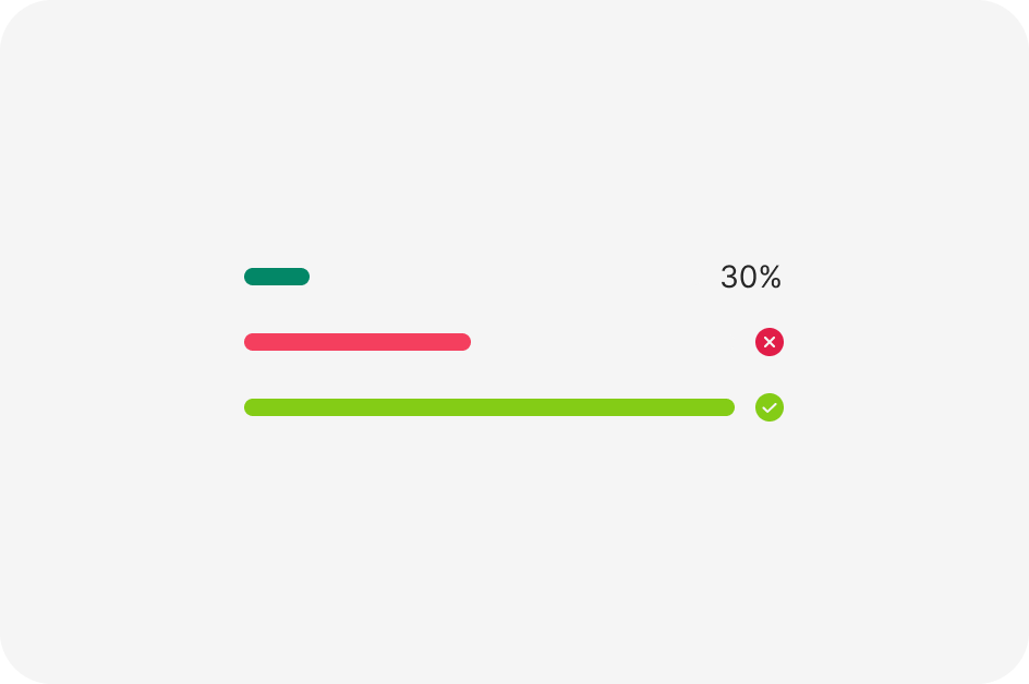
Progress Bar
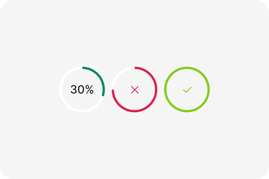
Progress Circle
Progress Step
Anatomy
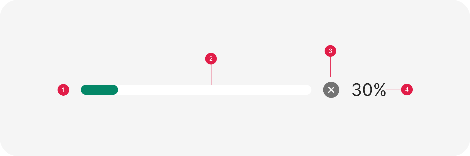
- Progress current
- Full bar progress
- Icon
- Value % progress
Usage
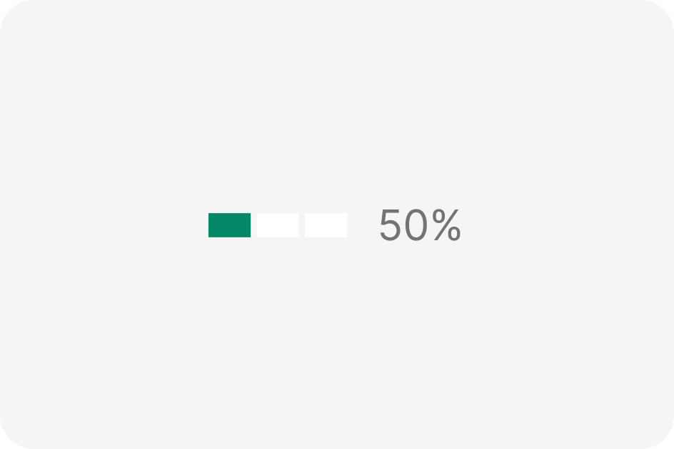
The use of a progress component within a design system is appropriate in various situations where visual indication of progression or completion is beneficial.
import React from 'react';
import { Progress } from 'antd';

const App: React.FC = () => <Progress percent={50} status="active" />;

export default App;