Pop over
Certainly! A Popover is a UI component commonly used in web and mobile applications to display additional information, options, or content in a floating container that appears above or near an associated element when triggered by user interaction, such as a click or hover.
Variant
Here are some types of popover, including:
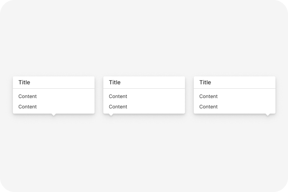
Top
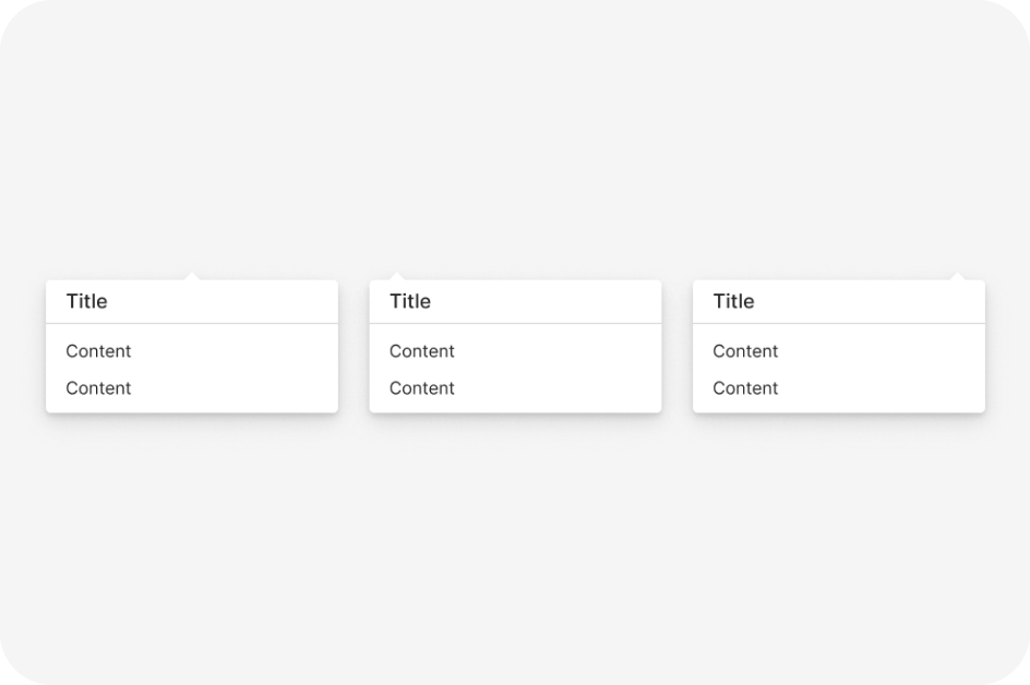
Bottom

Right
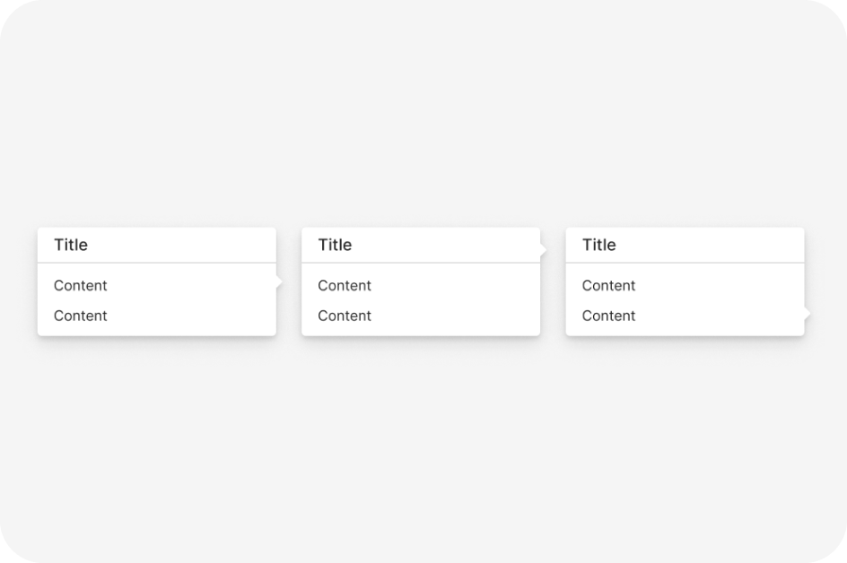
Left
Anatomy

- Arrow Popup
- Title
- Content
Usage
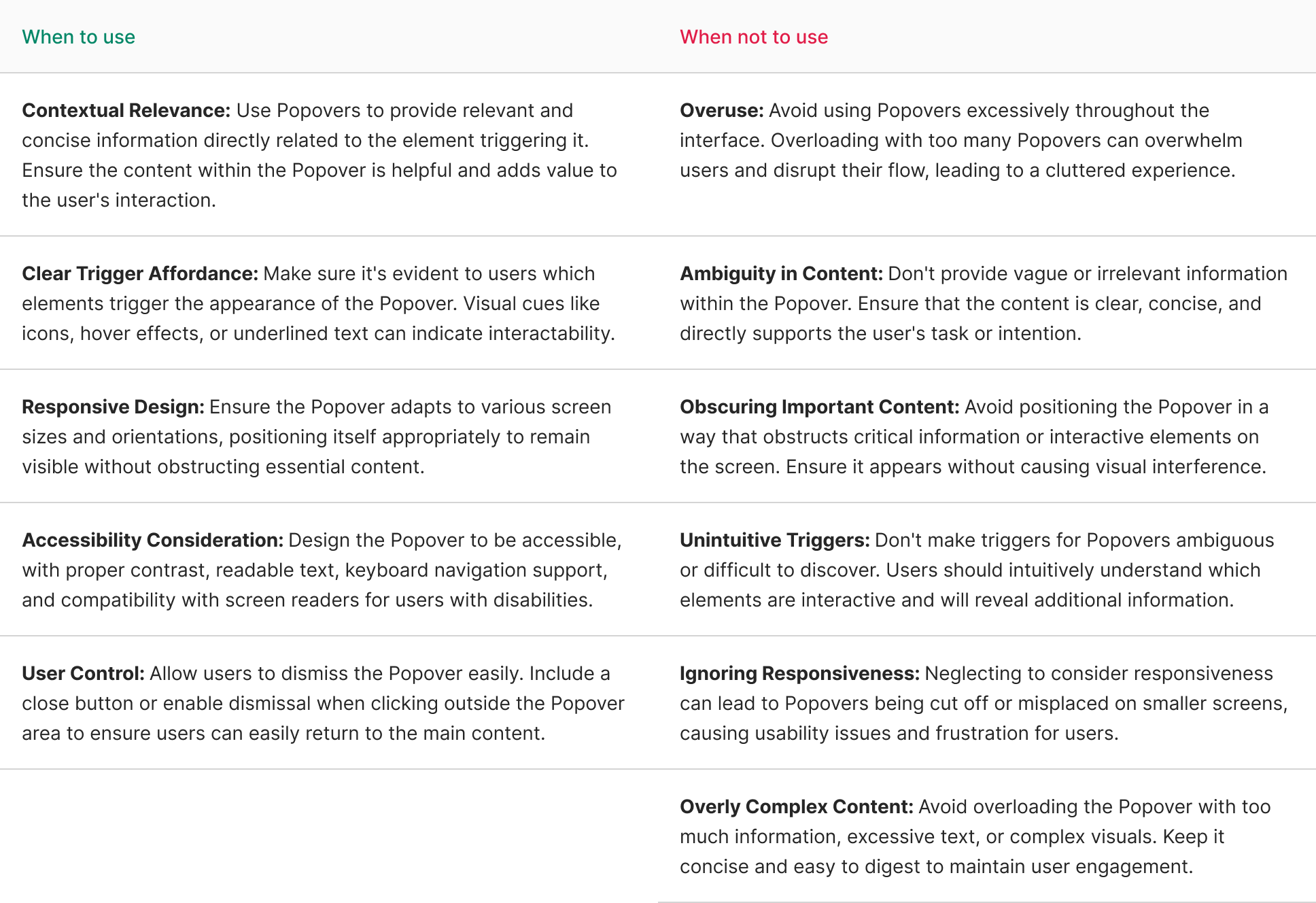
Popover components are useful for displaying additional information or options without cluttering the main interface. Here are scenarios where using a popover component can be beneficial:
import React from 'react';
import { Button, Popover } from 'antd';

const content = (
  <div>
    <p>Content</p>
    <p>Content</p>
  </div>
);

const App: React.FC = () => (
  <Popover content={content} title="Title">
    <Button type="primary">Hover me</Button>
  </Popover>
);

export default App;