Checkbox
Checkbox cards are a key element within our design system, offering a versatile way to present and interact with content while allowing users to make selections. These guidelines are designed to ensure a consistent and effective utilization of checkbox cards across our design ecosystem.
Variant
Here are some types of checkboxes, including:
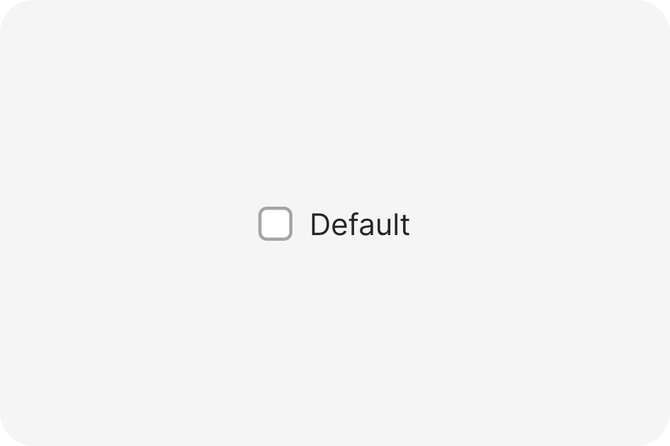
Default
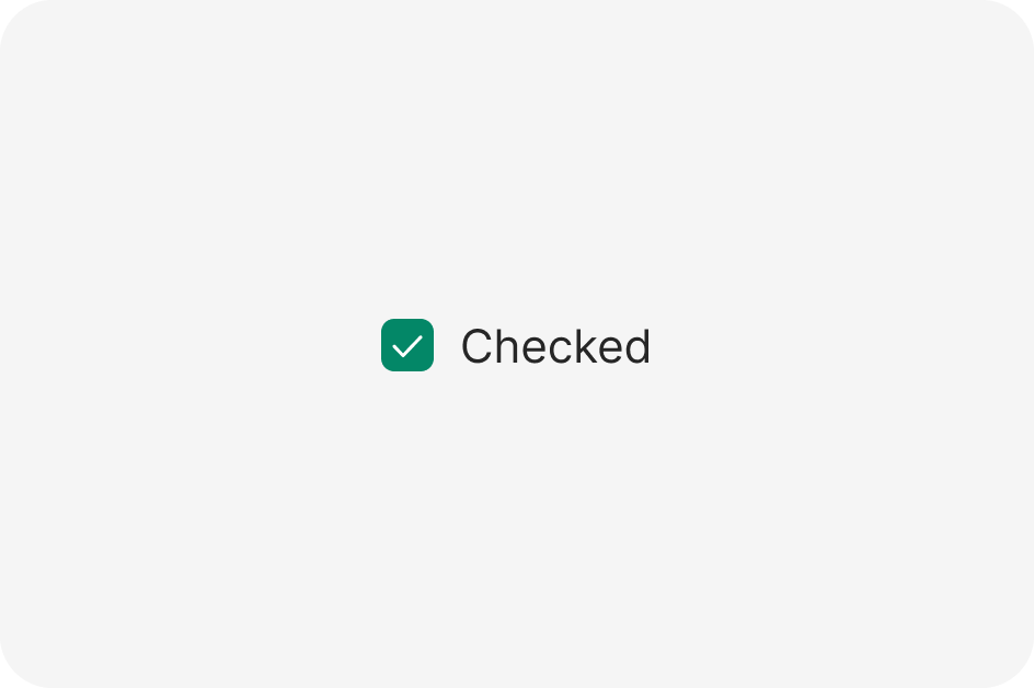
Checked
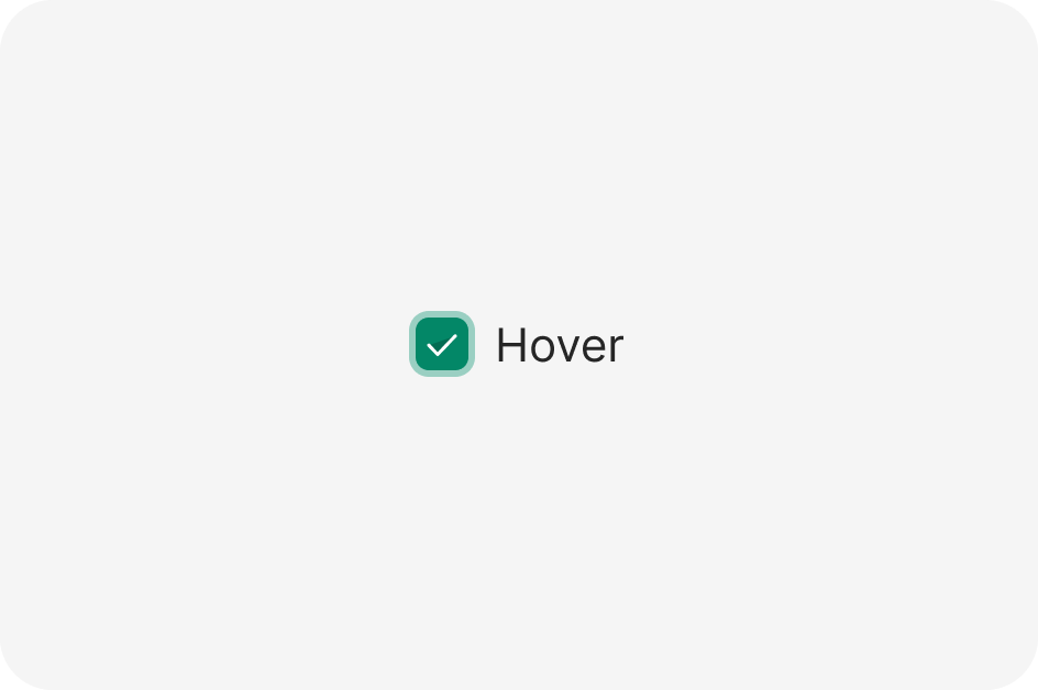
Hover
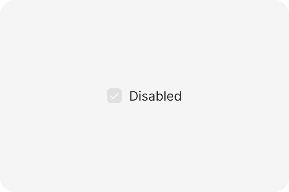
Disabled
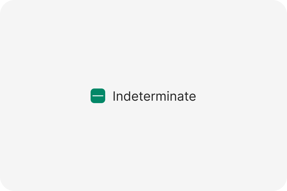
Indeterminate
Anatomy
The Alert component is used to display important information or alerts to users. It is commonly used for information, warnings, errors, success messages, and notifications.

- Icon
- Text
Usage

Behavior
While it makes sense to provide users with the information they need to make a good choice, providing them with too much information at once actually makes it harder to decide.
So while you might be tempted to stuff everything into labels and additional info, you should try to use progressive disclosure. This means using text links and to keep info hidden but close by.
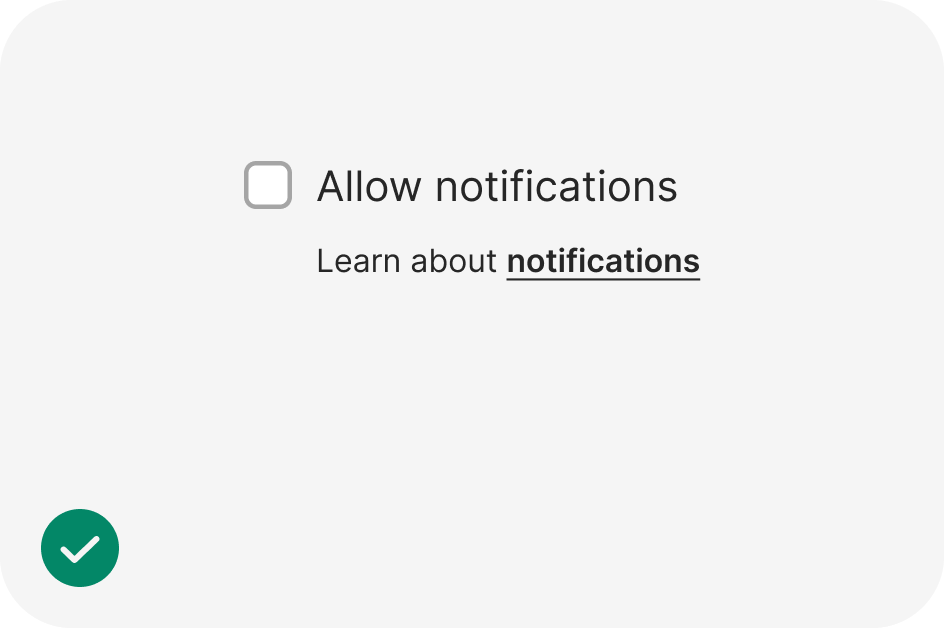
Do
Present only absolutely necessary information with interactions to offer more.
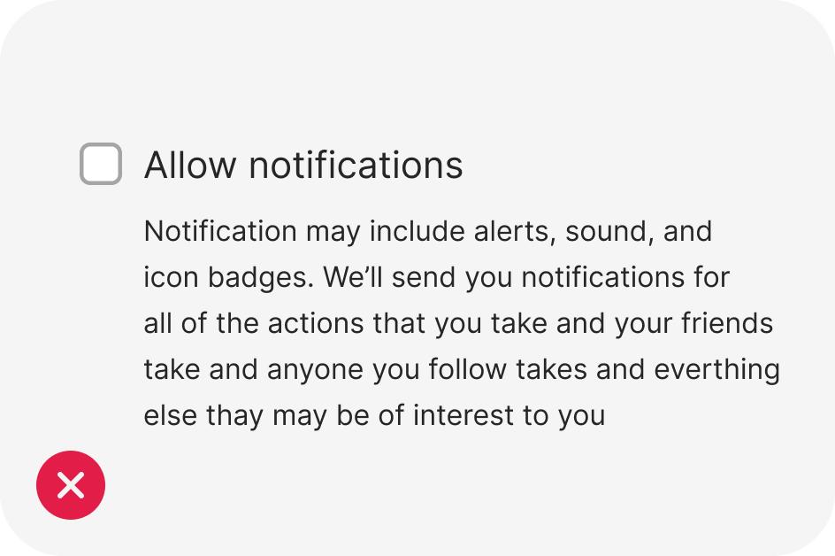
Don’t
Don’t overwhelm users with too much information at once.
Content
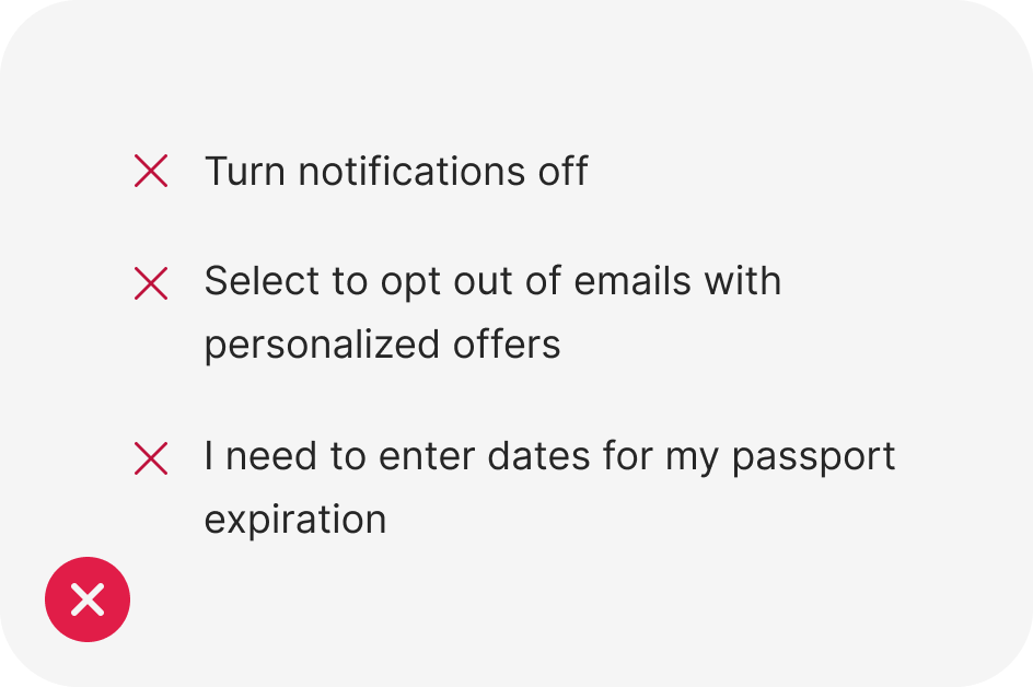
Write positive labels
In addition to writing positively in general, you should especially focus on positive labels for checkboxes. Focus on what happens when the checkbox is selected. Don’t use the selected state for turning off features.
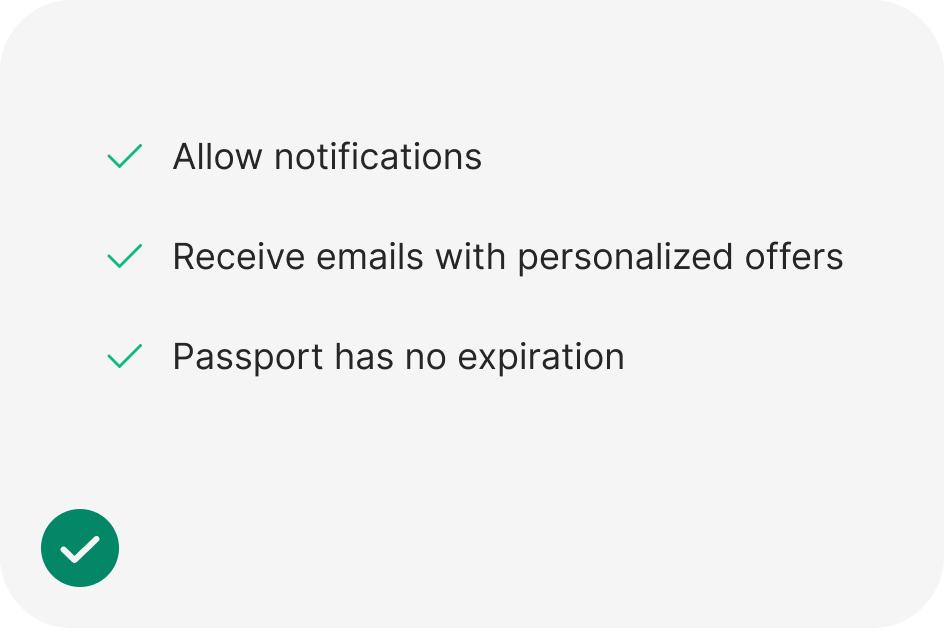
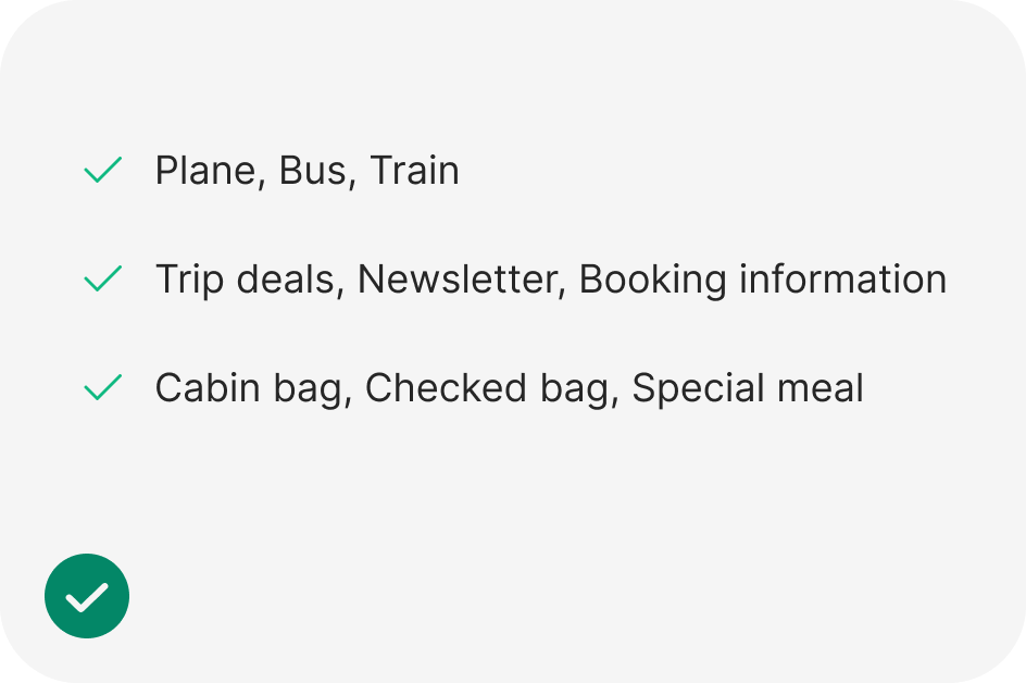
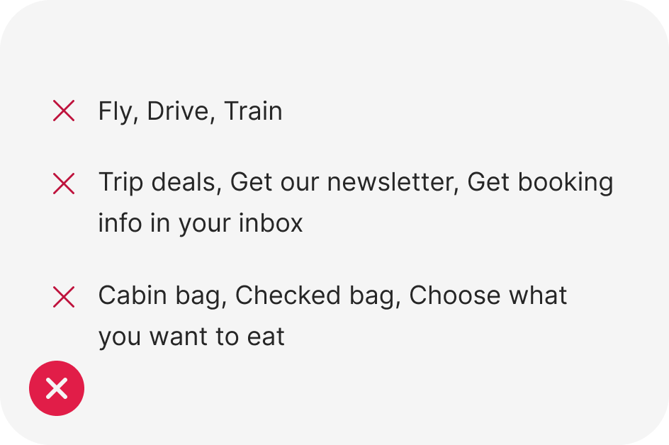
Use parallel labels
Whether you’re offering filters for transport options, types of notifications to receive, or additional services to purchase, always present options using the same structure.
import React from 'react';
import { Checkbox } from 'antd';
import type { CheckboxProps } from 'antd';

const onChange: CheckboxProps['onChange'] = (e) => {
  console.log(`checked = ${e.target.checked}`);
};

const App: React.FC = () => <Checkbox onChange={onChange}>Checkbox</Checkbox>;

export default App;