Avatar
An Avatar is a visual way to represent a person or brand in the product. They can display text, icons, or images.
Variant
Here are some types of alerts, including:
None
Dot
Count
Anatomy
- Input field
- Active suggestion list item
Usage
The AutoComplete component is an input field that offers suggestions for the user’s input as they type. These proposals are based on a predefined set of options. The AutoComplete helps to reduce the effort and time required to input data and to avoid errors that can occur due to typos or misspellings. The suggestions are displayed in a drop-down list, and the user can select one of the options or continue typing their own input.
- Multiple Options: The AutoComplete allows users to search and select a specific value from a long list of options much quicker than scrolling through the entire list. If you need to provide fewer options to the user, consider using a picker or radio buttons.
- Item Content: Consider the width of the AutoComplete and keep the names of the options short and compact so that they fit. Long item names that occupy multiple lines are hard to perceive and must be avoided.
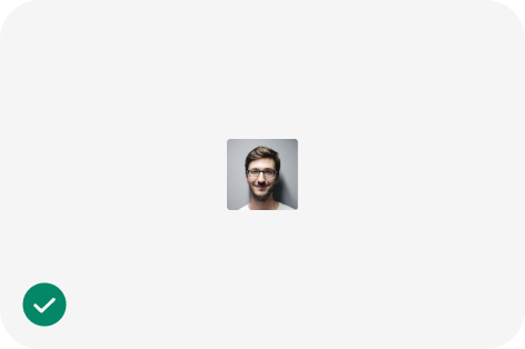
Use the size and border radius options provided by the Avatar to achieve the desired look-and-feel.
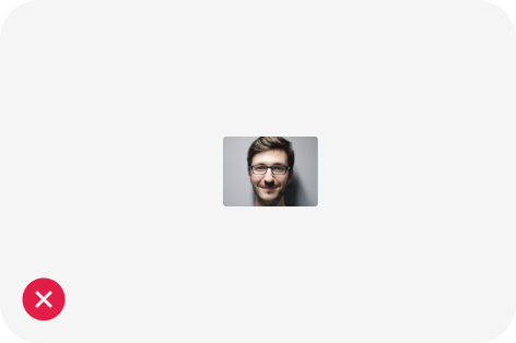
Avoid changing the 1:1 aspect ratio between the width and height of the Avatar.
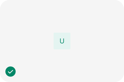
Use initials and short words to represent the meaning of the Avatar.
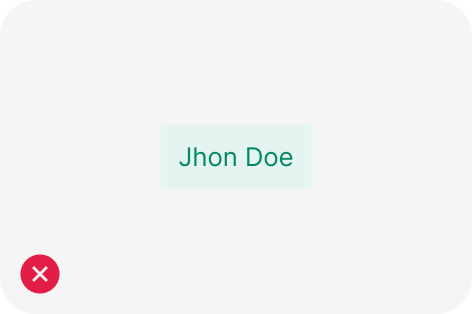
Avoid using long labels that distort the Avatar.
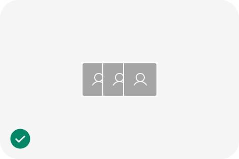
Use Avatars of equal size, border radius, and content type if they are part of the same group.
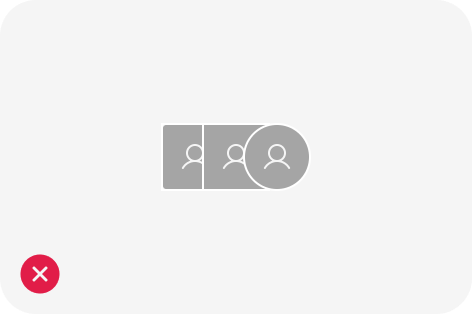
Avoid mixing sizes, border radiuses and different content types within a group of Avatars.
import React from 'react';
import { UserOutlined } from '@ant-design/icons';
import { Avatar, Space } from 'antd';

const App: React.FC = () => <Avatar shape="square" size={64} icon={<UserOutlined />} />;

export default App;