Auto complete
The AutoComplete component provides suggestions as you type, making it easier and faster to input data.
Variant
Here are some types of alerts, including:
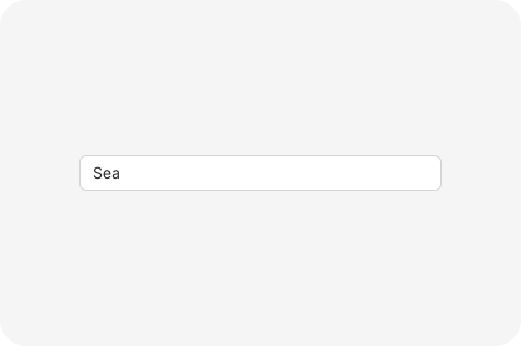
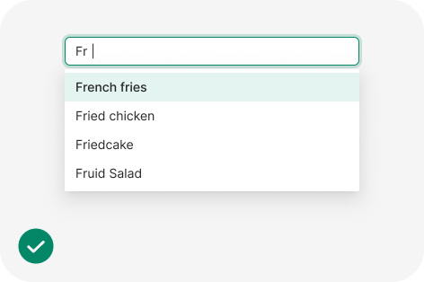
Normal
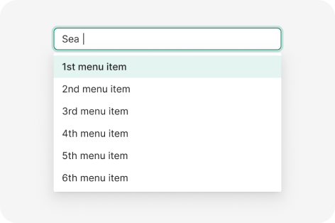
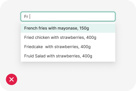
Focused
Anatomy

- Input field
- Active suggestion list item
- Popup with suggestion list items
Usage
The AutoComplete component is an input field that offers suggestions for the user’s input as they type. These proposals are based on a predefined set of options. The AutoComplete helps to reduce the effort and time required to input data and to avoid errors that can occur due to typos or misspellings. The suggestions are displayed in a drop-down list, and the user can select one of the options or continue typing their own input.
- Multiple Options: The AutoComplete allows users to search and select a specific value from a long list of options much quicker than scrolling through the entire list. If you need to provide fewer options to the user, consider using a picker or radio buttons.
- Item Content: Consider the width of the AutoComplete and keep the names of the options short and compact so that they fit. Long item names that occupy multiple lines are hard to perceive and must be avoided.
Use the AutoComplete when your list of options is complex enough to take advantage of the search functionalities.
Avoid using the AutoComplete if the list contains only a few options.
Keep the description of the AutoComplete options as short as possible to improve readability.
Avoid using lengthy option descriptions because the text can get truncated and users will find it difficult to read.
import React, { useState } from 'react';
import { AutoComplete } from 'antd';

const mockVal = (str: string, repeat = 1) => ({
  value: str.repeat(repeat),
});

const App: React.FC = () => {
  const [value, setValue] = useState('');
  const [options, setOptions] = useState<{ value: string }[]>([]);
  const [anotherOptions, setAnotherOptions] = useState<{ value: string }[]>([]);

  const getPanelValue = (searchText: string) =>
    !searchText ? [] : [mockVal(searchText), mockVal(searchText, 2), mockVal(searchText, 3)];

  const onSelect = (data: string) => {
    console.log('onSelect', data);
  };

  const onChange = (data: string) => {
    setValue(data);
  };

  return (
    <>
      <AutoComplete
        options={options}
        style={{ width: 200 }}
        onSelect={onSelect}
        onSearch={(text) => setOptions(getPanelValue(text))}
        placeholder="input here"
      />
      <br />
      <br />
      <AutoComplete
        value={value}
        options={anotherOptions}
        style={{ width: 200 }}
        onSelect={onSelect}
        onSearch={(text) => setAnotherOptions(getPanelValue(text))}
        onChange={onChange}
        placeholder="control mode"
      />
    </>
  );
};

export default App;