Alert
Alert is used to communicate important information or feedback to the user. It is designed to grab the user’s attention and convey a specific message in a clear and concise manner.
Variant
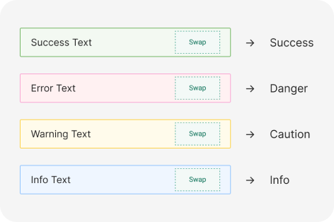
Here are some types of alerts, including:
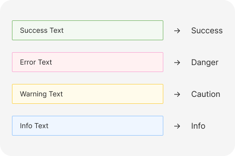
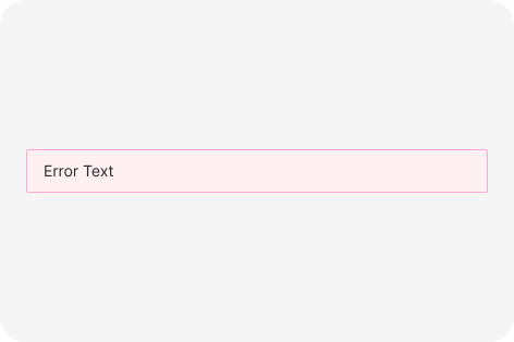
Basic Variant
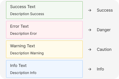
Description
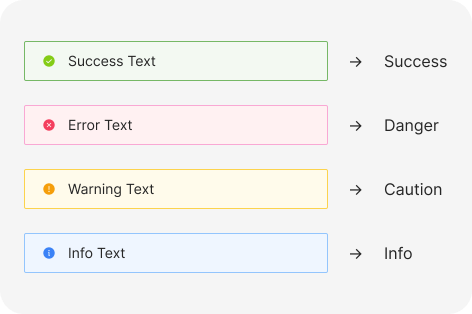
Icon
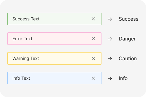
Close button
Custom
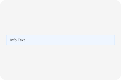
Info alert
Info alerts are the most common alerts. Use them to guide a user’s attention to relevant details, but keep it focused and related to the topic on the screen.
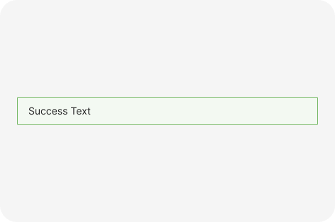
Success alert
Success alerts confirm that an instruction from the user, such as to make a payment or request a refund, was processed successfully. Usually used without an action button.
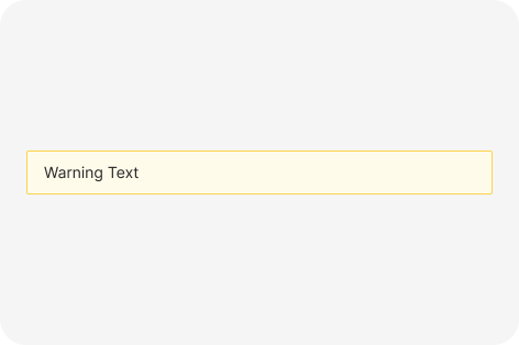
Caution alert
Use caution alerts when you need to inform users about a potentially unfavorable situation that requires eventual action from them. If the issue requires immediate attention, use a critical alert.
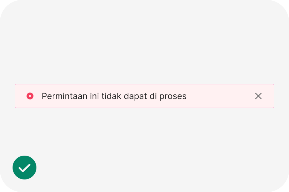
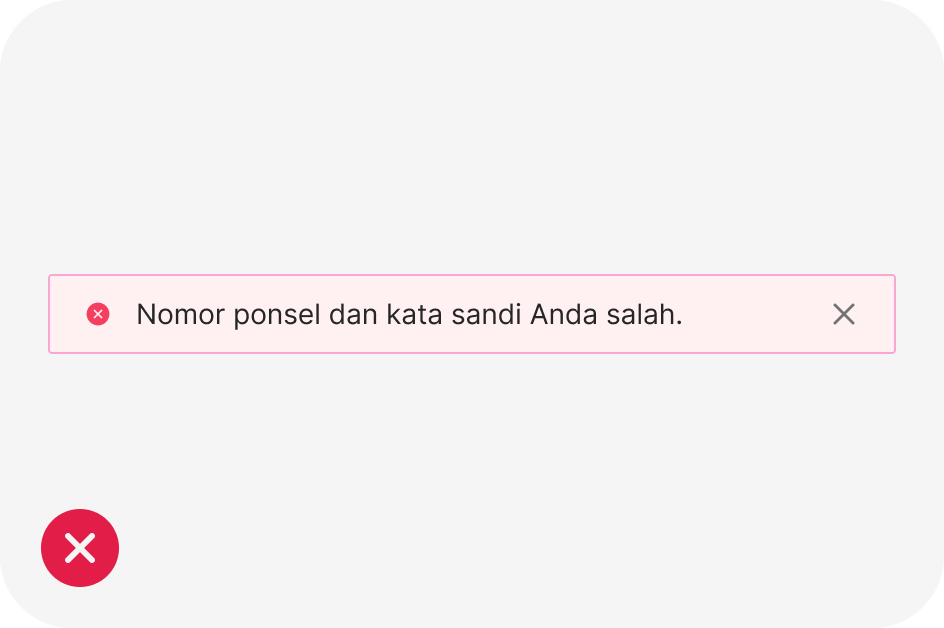
Danger alert
Use danger alerts when something is blocking users from continuing or an issue needs to be resolved immediately. The alert should offer a solution to the problem.
Anatomy
The Alert component is used to display important information or alerts to users. It is commonly used for information, warnings, errors, success messages, and notifications.
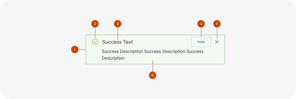
- Container
- Icon
- Title
- Custom Component
- Close Button
- Description
Usage
The Alert component is employed to convey crucial information or notifications to users. It’s commonly used in web applications, online forms, and similar situations to inform users about updates or errors.

Accessibility
Accessibility is a crucial aspect of designing and implementing the Alert component to ensure that it’s usable by all individuals. Here are some considerations for making Alert accessible:
- Use clear and concise text: Ensure the text in the Alert is easy to read and understand, with a font size and color contrast that meets accessibility standards.
- Ensure proper color contrast: The Alert’s color should contrast well with the background to make it visible to users with color blindness or low vision. A minimum contrast ratio of 4.5:1 between text and background is recommended by WCAG.
- Use ARIA attributes: Employ ARIA attributes to label the Alert as an alert and provide additional context for screen readers.
- Include a focus indicator: Make sure the Alert has a visible and easily identifiable focus indicator for keyboard users navigating the website or application.
- Allow sufficient time for message reading: Some users may need extra time to read the Alert due to disabilities. Ensure the Alert remains visible long enough for users to read and process the information.
- Use descriptive icons: If icons are used, ensure they are descriptive and not solely reliant on color to convey meaning. This aids users with visual impairments or color blindness in understanding the Alert’s type.
- Test with assistive technology: Thoroughly test the Alert component with assistive technology like screen readers and keyboard-only navigation to ensure accessibility for users with disabilities.
Clear and concise language for the alert message
Unclear or misleading language for the alert message.
import React from 'react';
import { Alert } from 'antd';

const App: React.FC = () => <Alert message="Success Text" type="success" />;

export default App;