Input
The Input Fields component is a fundamental element within design systems, providing a structured and user-friendly way for users to input various types of data, such as text, numbers, dates, and more. These components are crucial for forms, search bars, and other interactive elements where user input is required. In design systems, the Input Fields component plays a pivotal role in maintaining consistency and usability across a range of interfaces.
Variant
Here are some types of input, including:
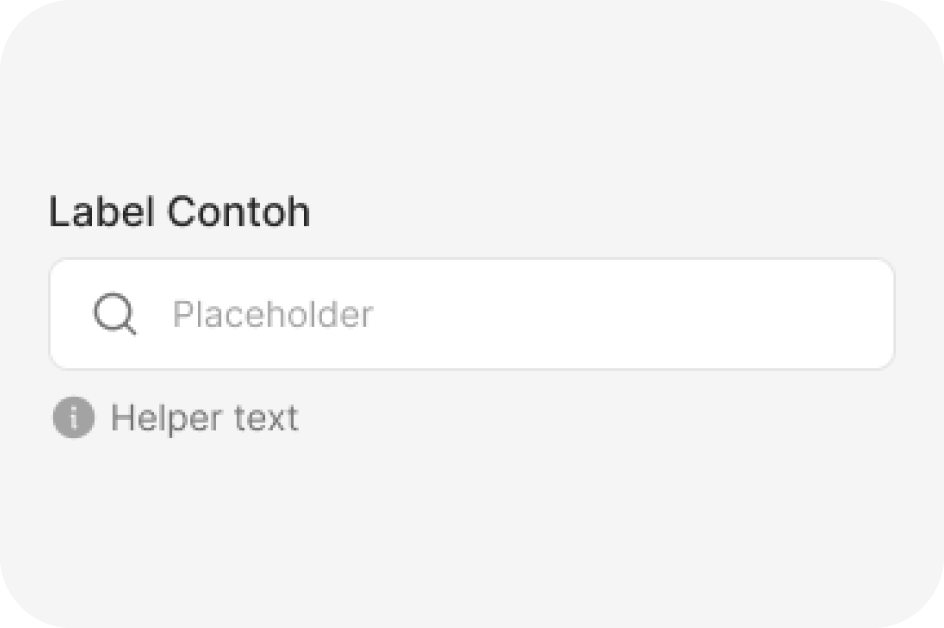
Default
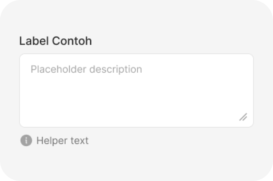
Text area
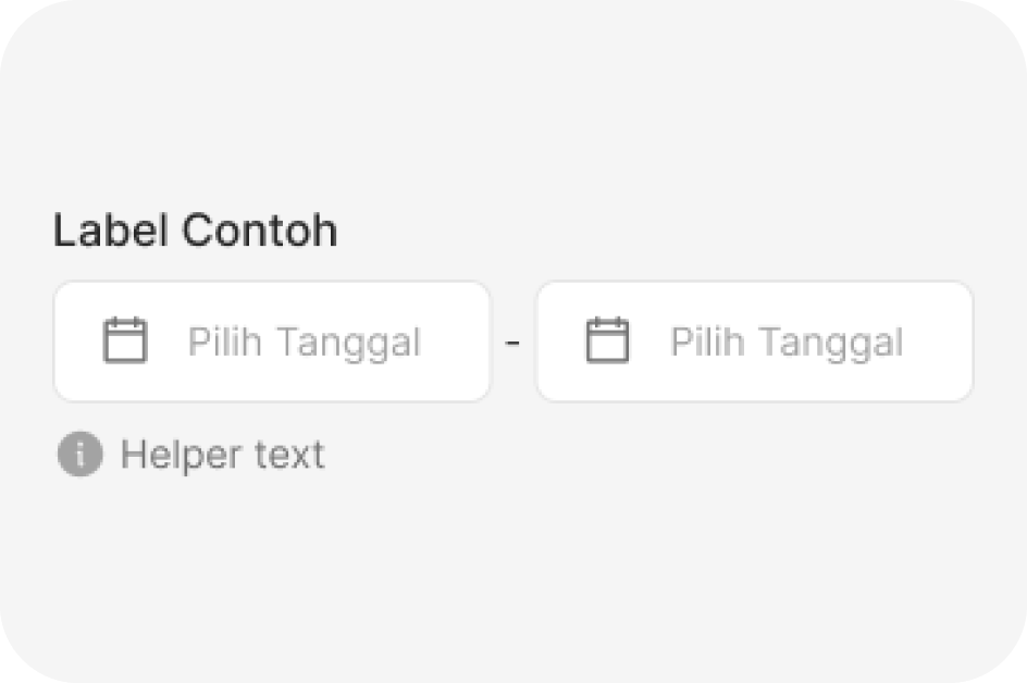
Date Input
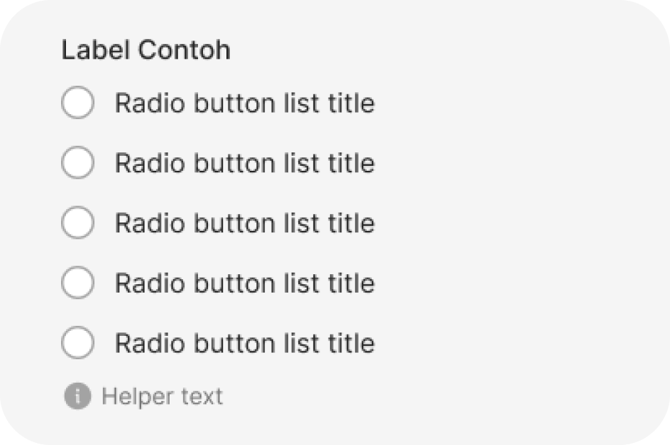
Radio list
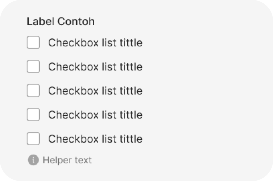
Checkbox List
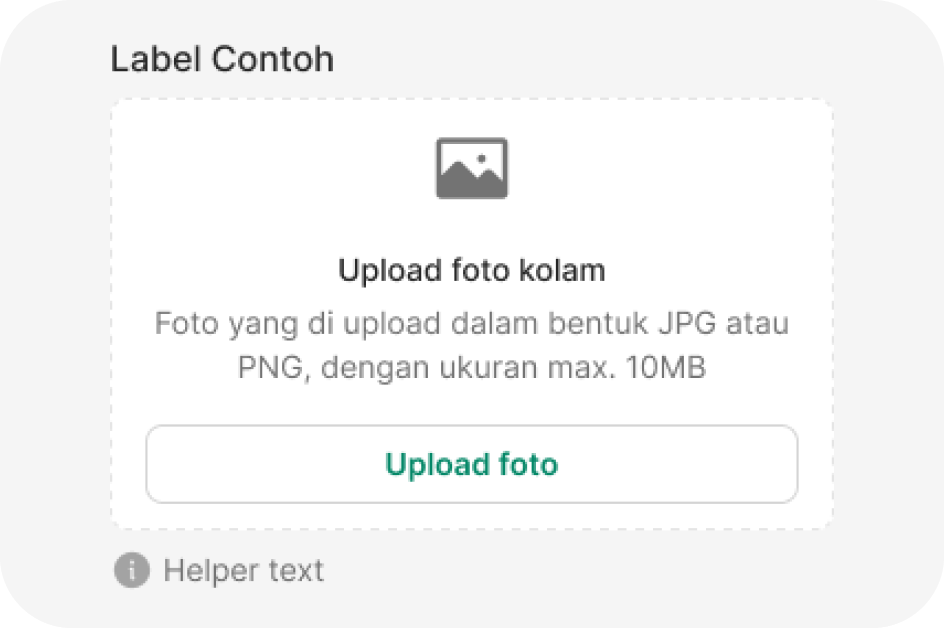
File input
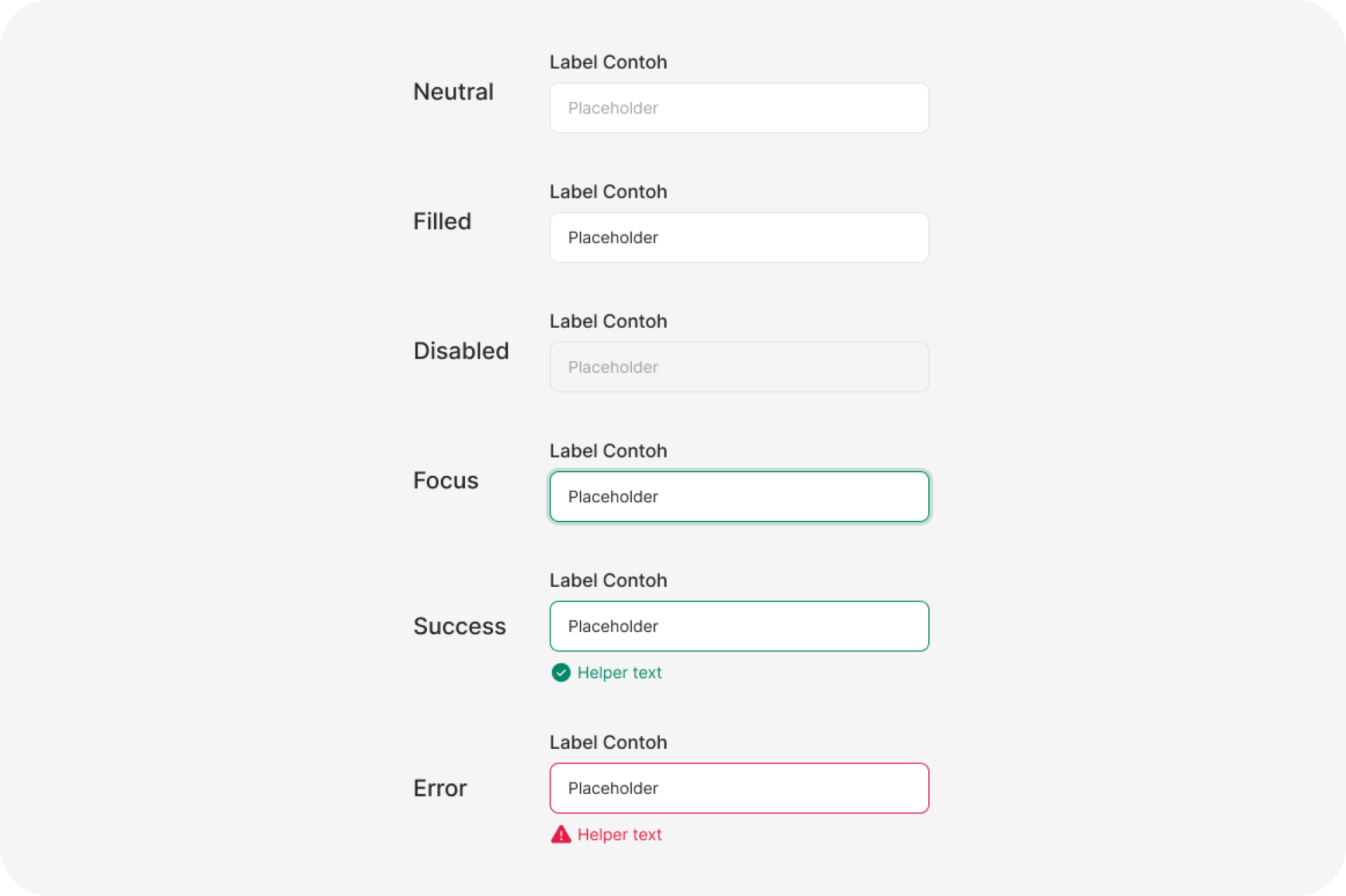
State
Anatomy
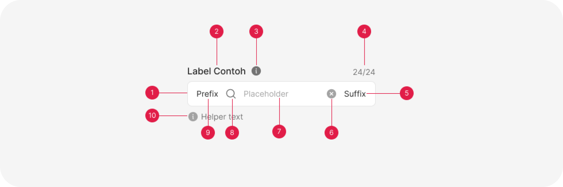
- Container
- Label
- Tooltip (Optional)
- Character count (Optional)
- Sufix (Optional)
- Clear text
- Input text
- icon (Optional)
- Prefix (Optional)
- Helper (Optional)
Usage
Input fields play a pivotal role in user interfaces, offering users a versatile and interactive means to input data or information. These elements are frequently found within forms, search bars, registration screens, and various other user interactions where data input is necessary. They serve as the digital counterpart of paper forms, enabling users to input a wide range of data, including but not limited to names, addresses, email addresses, passwords, dates, and free-text comments.
In the context of user interaction, input fields act as essential conduits for communication between the user and the digital application. They facilitate the exchange of information, enabling users to provide data that the application can process, store, or transmit. Whether it’s filling out a login form to access an account, entering shipping information for an online purchase, or simply conducting a search query on a website, input fields are ubiquitous and integral components of the user experience.
Despite their ubiquity, input fields come in various forms, each tailored to specific data types and use cases. Single-line text fields are commonly used for concise inputs like names and email addresses. Multi-line text areas are employed for longer textual entries, such as comments or descriptions. Numeric input fields are ideal for numerical data, including dates, phone numbers, or quantities, while password fields enhance security by concealing the entered characters.
In addition to their functional diversity, input fields also support user guidance and feedback. Clear and descriptive labels help users understand what is expected in each field, while placeholder text can provide additional hints. Input validation ensures that the data entered is accurate and meets specific criteria, such as the correct format for an email address or the required length of a password. When errors occur, well-designed input fields display error messages to guide users toward corrective action.
Input fields are further enhanced by responsiveness, adapting to different screen sizes and orientations, and accessibility features that make them usable by individuals with disabilities. Their design within a design system ensures visual consistency while allowing for customization to align with various design themes and branding elements.
In conclusion, input fields are indispensable components of user interfaces, serving as conduits for users to input diverse forms of data and information. Their design, functionality, and usability significantly impact the overall user experience and, therefore, warrant careful consideration and adherence to best practices within design systems and interface development.
Input fields
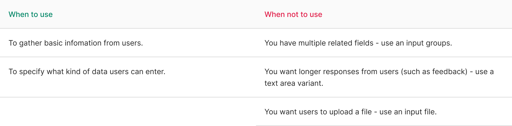
Setting the proper input mode for the field (such as number, email address) helps make it clear what’s expected. It also displays the correct on mobile devices, making it easier for users to complete the field.
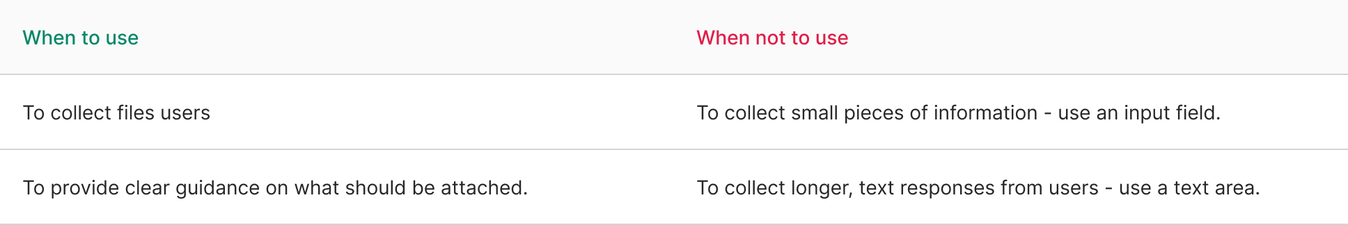
Input file
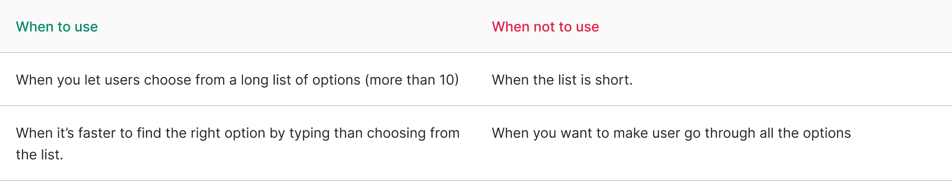
Input select
InputSelect works well to present many different options in a compact unit. By allowing users to type to filter options, they don’t have to scroll through tens of options to find what they’re looking for.
If the amount of options isn’t so big and/or it’s expected that the user goes through all of them before making a choice, consider using the traditional Select component instead.
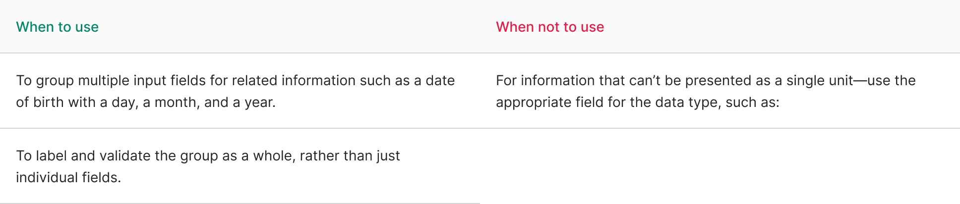
Input group
Input groups override the settings of individual fields to present a coherent whole. This means they’re great for a couple of fields that make a single unit.
They’re not good at grouping many fields, such as everything that goes into building an address. For those cases, use visual spacing, logical headers, and other structure to make it clear what fields are related..
Content
Use labels
Labels serve to clearly present what’s expected. They’re especially important for people who don’t see other visual cues. But they also help everyone know exactly what to enter.
Use error and help messages
In more complex form fields, labels alone might not suffice. In such cases, it’s essential to provide clear and concise help messages to guide users before they start entering information. Additionally, when errors occur, present error messages that are calm, constructive, and solution-oriented, as negative messages can frustrate users.
Include placeholder examples
Placeholder text can be a valuable aid in providing additional information or examples to assist users. However, it’s crucial to remember that placeholder text is typically less visually prominent, often with low contrast, and disappears as soon as users begin entering their own information. Therefore, avoid placing essential instructions or information in placeholder text.
Instead, use placeholder text for supplementary information that can enhance the user experience. Also, remember to add placeholder text to each individual field rather than to an entire input group. This ensures that the context and guidance are clear for each specific field.
Designing forms
Layout
For simple forms, use a one-column layout, as it guides users to complete fields in a clear, sequential manner. This is especially important for mobile devices to maintain consistency across platforms. Complex forms benefit from a multi-column layout, which shortens the form’s length and makes it more compact.
Layout in modals
Forms in modals should be kept simple and concise due to limited space. Utilize a one-column layout in modals.
Grouping Fields with Related Content
When dealing with fields containing related content (e.g., parts of an address), consider using groups or reducing gaps between related fields to visually show their connection. Input groups can be used in certain cases.
Using Wizards
Break lengthy forms into steps to enhance user understanding and completion rates. Consider employing a Wizard component for this purpose.
Diversification of Input Types
Choose the appropriate form components for different types of information you need from users. For instance, use InputFile when collecting attachments instead of relying solely on InputField and Select components.
Working with Calls-to-Action
Ensure clear, visible call-to-action buttons in forms. Distinguish between primary and secondary buttons, and position primary buttons to the right and secondary buttons to the left. If space is limited, place the primary button above the secondary one. Use concise and attention-grabbing button labels to improve readability and speed up the process.
Validation
Implement inline validation to handle errors in forms. Display the first error message in the form without overwhelming users with all messages at once. Hide other error messages but mark them with a red exclamation mark. Users can view these messages when they focus on the corresponding field. This approach is recommended for all forms to enhance the user experience.
import { Input } from '@efishery/onefish'

const function App = () => {
  return (
    <Input placeholder='Basic usage'  />
  )
}