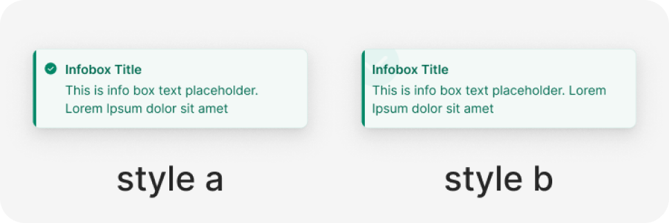
Infobox
The InfoBox component is a versatile and informative element within design systems. It serves the purpose of presenting concise information, key messages, or supplementary details to users in a visually appealing and structured format. In design systems, the InfoBox is a fundamental tool that can be used across various interfaces to enhance user engagement and understanding.
Variant
Here are some types of infobox, including:
State
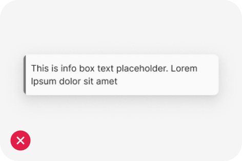
Anatomy

- Container
- Icon
- Title
- Description
Usage
An “Infobox” component is utilized to convey critical information or provide feedback to the user. Its purpose is to promptly capture the user’s attention and deliver a precise message in a clear and succinct manner.
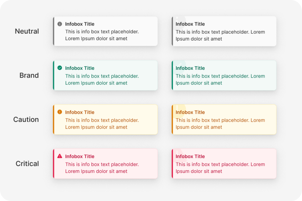
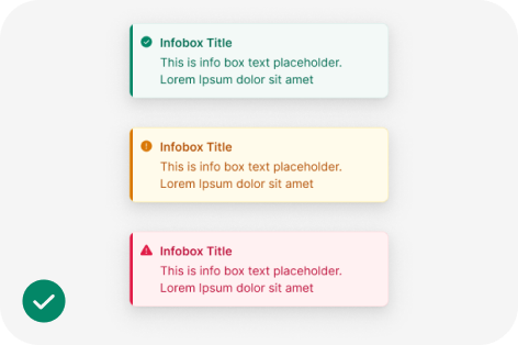
Infobox types
There are four types of infobox: Neutral (Info), succes, caution, and critical.
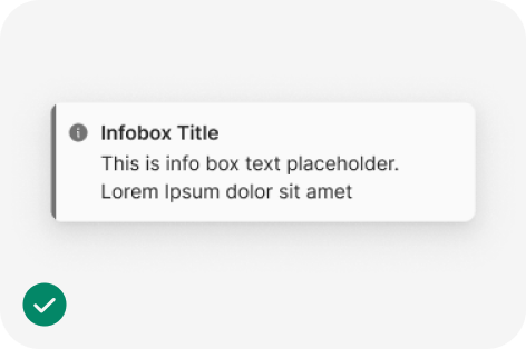
Neutral (info)
Informational Infobox are the most common user’s guide. Use them to guide a user’s attention to relevant details, but keep it focused and related to the topic on the screen.
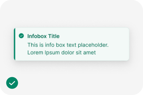
Success
Success infobox confirm that an instruction from the user, such as to make a payment or request a refund, was processed successfully. Usually used without an action button.
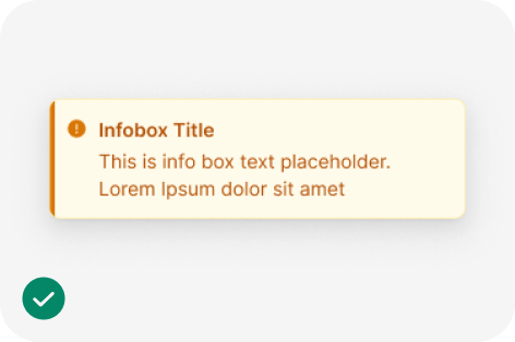
Caution
Use caution infobox when you need to inform users about a potentially unfavorable situation that requires eventual action from them. If the issue requires immediate attention, use a critical alert.
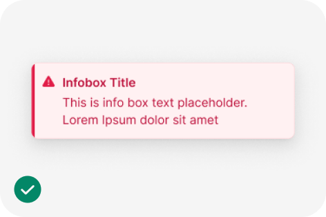
Critical
Use critical infobox when something is blocking users from continuing or an issue needs to be resolved immediately. The infobox should offer a solution to the problem.
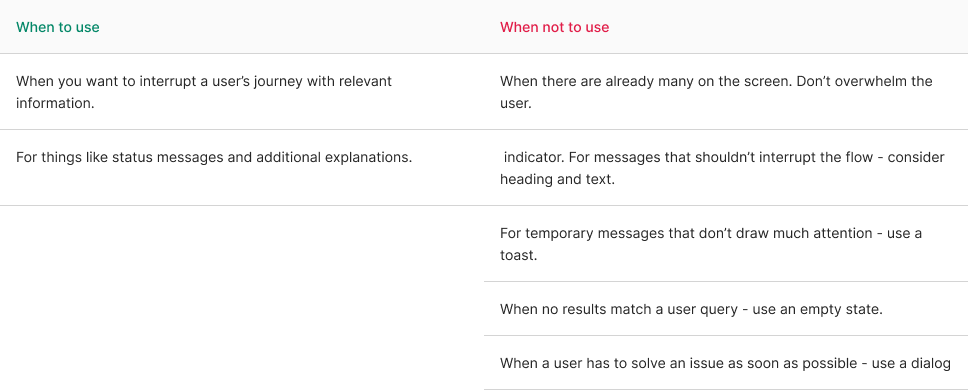
Explain infobox
When an Infobox interrupts a user, it’s crucial to clarify the reason for the interruption. You should confirm the action that will occur or describe what has just taken place.
To do this effectively, keep the message clear, concise, and straightforward. Remember, alerts disrupt the user’s flow, so it’s best to provide just enough information to explain why this interruption is necessary.
For longer messages, consider using a title to provide a quick summary. Users typically see the title first as they scan the message. If you need to add more context to the alert, you can include a brief description. In the case of more complex messages, you can offer users the option to access further information through an action button. This allows them to get the details they need while keeping the initial alert message concise and to the point.
Use more than just color
To ensure maximum accessibility, it’s important to ensure that the message is easily understandable based on its content. Additionally, icons can be used to reinforce and support the message. It’s worth noting that relying on color alone may not be sufficient to distinguish between different types of infobox, so incorporating other visual cues, such as icons or specific text, is essential for effective communication.
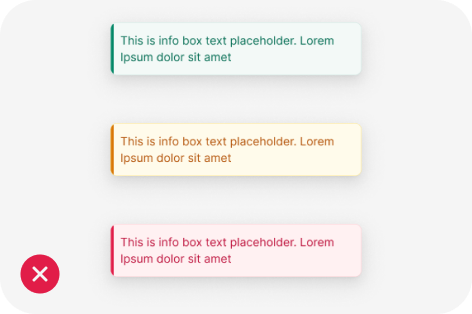
“Without icons, people with color blindness might see success and critical alerts as the same. Add icons especially for warning and critical alerts.”