Date & Time picker
The date and time picker component is a crucial part of our design system, enabling users to select dates and times efficiently. These guidelines are designed to ensure a consistent and effective use of date and time picker components across our design ecosystem.
Variant
Here are some types of date & time picker, including:

Anatomy

Date picker
- Month pagination
- Year selection
- Current date
- Selected date
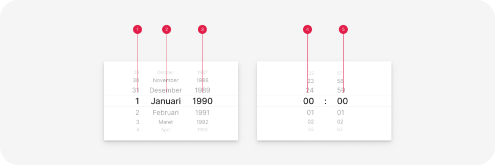
Selector
- Date
- Month
- Year
- Hour
- Minute
Usage
Date picker
Date pickers enable users to choose a specific date or a range of dates. They should be appropriate for the context in which they are used. Date pickers can be integrated into:
- Dialogs or bottom sheets on mobile.
- Dropdowns in text fields on desktop.
Date picker for range
Use a calendar picker to select a date within a range of 6 months ahead or behind.
Date picker for birth date
If the date falls outside a 1-year range, avoid using the date picker.
Selector
Use a date and time selector for more concise usage, such as when inputting time without specifying a time range in an input.
Selector
Use a date selector for dates that fall outside a 1-year range, such as Date of Birth.