Checkboxes
Checkbox cards are a key element within our design system, offering a versatile way to present and interact with content while allowing users to make selections. These guidelines are designed to ensure a consistent and effective utilization of checkbox cards across our design ecosystem.
Variant
Here are some types of checkboxes, including:

Usage
- Checkbox cards are designed for presenting a list of options or items, each accompanied by a checkbox. Users can select one or more options by toggling the checkboxes.
- They are useful for tasks like selecting preferences, filtering content, or making choices within forms.
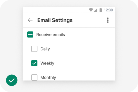
Do
Checkboxes let users select one or more options from a list. A parent checkbox allows for easy selection or deselection of all items.
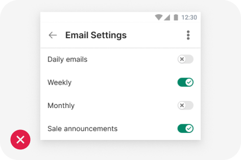
Don't
If a list consists of multiple options, don't use switches. Instead, use checkboxes. Checkboxes imply the items are related, and take up less visual space.
Behavior
Provide users with feedback when they interact with checkbox cards.
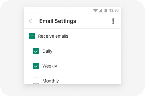
Scrollable card.
Selecting multiple items in a list using checkboxes
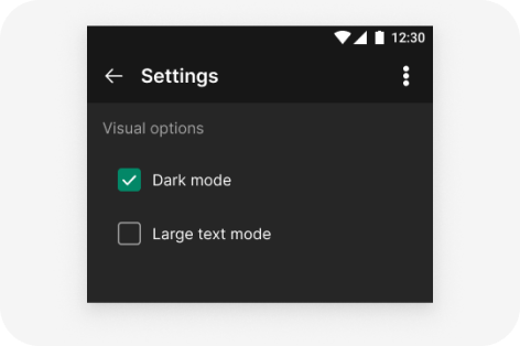
2 Column grid
Turning an item on or off using a checkbox
Parent and child checkboxes
Checkboxes can have a parent-child relationship with other checkboxes.
- When the parent checkbox is checked, all child checkboxes are checked
- If a parent checkbox is unchecked, all child checkboxes are unchecked
- If some, but not all, child checkboxes are checked, the parent checkbox becomes an indeterminate checkbox
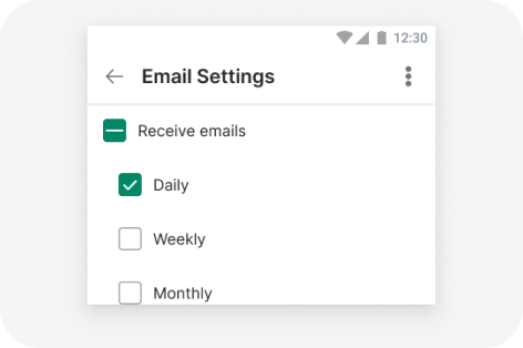
indeterminate state of a parent checkboxes
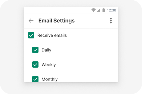
Checked state of a parent checkboxes
import { Checkbox } from '@efishery/onefish'

const function App = () => {
  return (
    <Checkbox defaultChecked>Checkbox</Checkbox>
  )
}