Card
Cards encapsulate both content and actions related to a single topic.
Usage
Utilize a card to present information and actions pertaining to a single subject.
Cards should be designed for quick and efficient scanning, making it easy for users to find pertinent and actionable information. Ensure that elements such as text and images are arranged on the card in a manner that clearly conveys their hierarchy and importance.
Usage
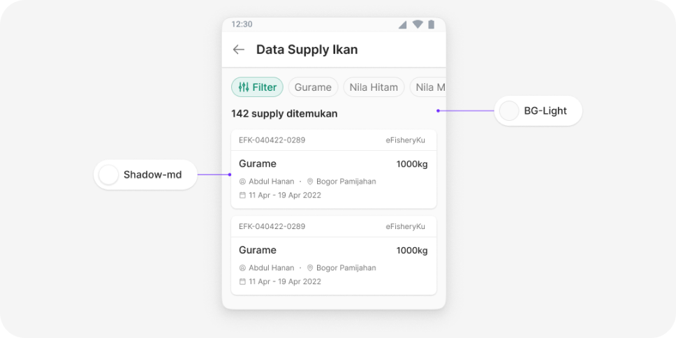
Light grey background
Use a light grey background to make the card's shape more easily recognizable.
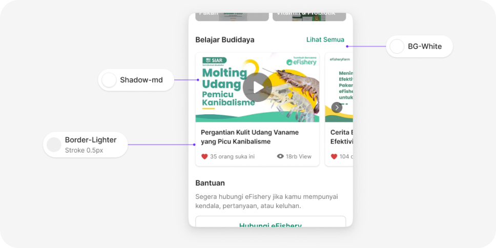
White background
If you must use a white background, apply a 0.5px Border-Lighter color border to make the card's shape more distinct.
Margin
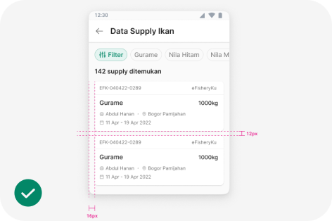
Default margin (16px)
The default margin used in the default layout
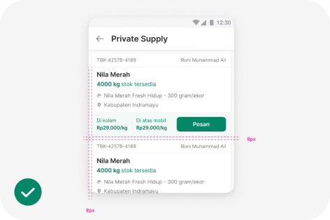
Small margin (8px)
It is used for components with dense content that require additional space.
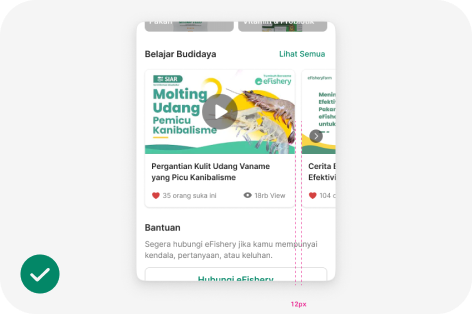
Scrollable card.
Use a 12px margin for scrollable cards.
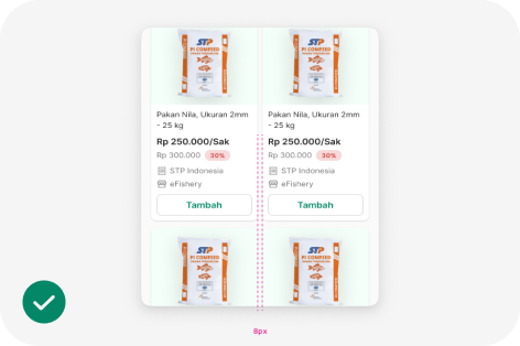
2 Column grid
Apply an 8px margin for 2-column cards.
Content
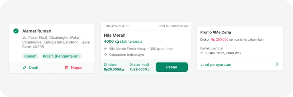
- Hanya gunakan font weight medium atau semibold untuk informasi yang paling penting.
- Selain itu gunakan font weight reguler dan warna text secondary
- Jika diperlukan, gunakan icon untuk mempermduah user membaca informasi
- Posisikan action yang diperlukan di bawah card
- Hanya gunakan warna text primary untuk informasi penting, selain itu gunakan warna text secondary.
- Dapat menggunakan warna brand untuk meng-highlight informasi penting
- Jika ada bagian informasi yang perlu di-highlight, gunakan warna surface-brand
import { Card, CardBody } from '@efishery/onefish'

const function App = () => {
  return (
    <Card>
      <CardBody>
        <Text>View a summary of all your customers over the last month.</Text>
      </CardBody>
    </Card>
  )
}