Badge
Badge components are the unsung heroes of user interface design. These small, unassuming elements pack a punch, serving a wide range of purposes and enhancing the user experience in numerous ways. In our design system, we recognize the power of badge components and have harnessed their versatility to create a more engaging and informative interface.
Variant
Here are some types of alerts, including:
Anatomy
The Alert component is used to display important information or alerts to users. It is commonly used for information, warnings, errors, success messages, and notifications.
- Container
- Text badge
- Dots (optional)
Usage
In our design system, we embrace badge components as indispensable tools for creating a more engaging, organized, and user-friendly interface. By recognizing their versatility and employing them effectively, we aim to provide our users with a visually appealing and informative experience, contributing to their satisfaction and engagement with our products and services.
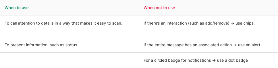
- Visual Signifiers: One of the primary roles of badge components is to provide visual signifiers. They help draw attention to specific elements or pieces of content, such as new items, alerts, or notifications. The use of badges in this manner ensures that important information is noticed without overwhelming the user.
- Status Indicators: Badge components also serve as status indicators. They can convey information about the status of an item, such as “In Progress,” “Completed,” or “Urgent.” This makes it easier for users to quickly understand the state of a particular item or task.
- User Engagement: Badges can be employed to encourage user engagement. They can represent achievements, gamification elements, or rewards, motivating users to interact with your platform, be it a website, app, or product. Badges create a sense of accomplishment and recognition.
- Content Categorization: In content-heavy applications, badges are invaluable for categorizing and organizing information. For example, they can label content as “New,” “Trending,” or “Featured,” helping users navigate and filter content more efficiently.
- Customization: Badge components offer the flexibility to be customized to match your brand’s visual identity. Whether it’s changing the color, shape, or size, badges can adapt to your design language while maintaining a consistent visual style.
- Accessibility: When implemented thoughtfully, badge components can improve the accessibility of your interface. They can be designed to meet contrast and readability standards, ensuring that all users, including those with disabilities, can benefit from the information conveyed by badges.
- Enhanced User Experience: The strategic use of badge components enhances the overall user experience by providing clarity, organization, and interactivity. Users can quickly grasp key information and take action based on the context provided by badges.
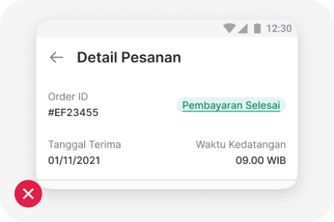
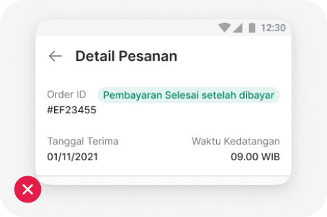
Subtle style
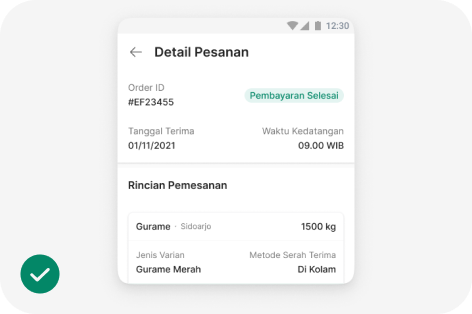
Badge as a status of a process. It's recommended to use a subtle style to make it less prominent than a button.
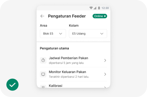
Bold badge
Use bold badges with suffix dots for statuses on the eFeeder platform.
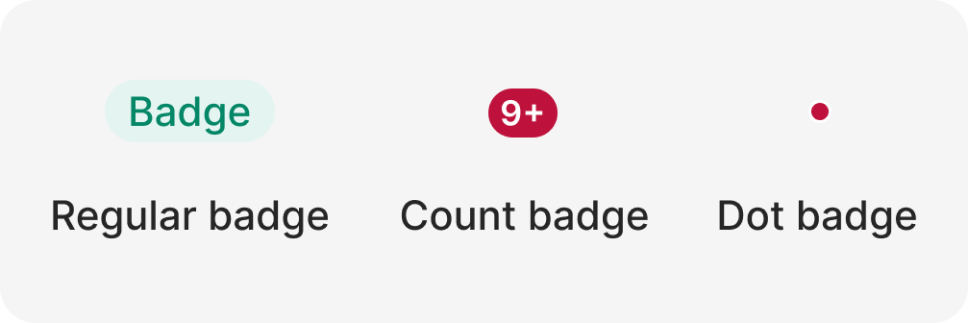
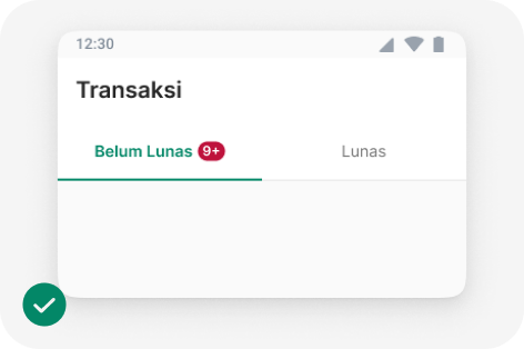
Count badge
Use a Count badge to indicate the number of items that are important for users to see immediately.
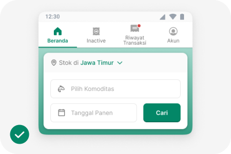
Dot badge
Use a Dot badge to indicate the presence of recent updates or important items in a navigation menu
Behavior
Badges show unchanging information and can be updated if a status changes, but they shouldn’t be clickable.
If you need to provide additional information, you can use a basic interaction like showing a tooltip when someone hovers over it. Just make sure it’s evident that there’s an interaction available.
Don’t combine with text link
Keep it short
import { Badge } from '@efishery/onefish'

const function App = () => {
  return (
    <Badge colorScheme='green'>Success</Badge>
  )
}