Appbar
The top app bar displays information and actions relating to the current screen.
Variant
Here are some types of alerts, including:

Default

Searchbar
Anatomy
The Alert component is used to display important information or alerts to users. It is commonly used for information, warnings, errors, success messages, and notifications.
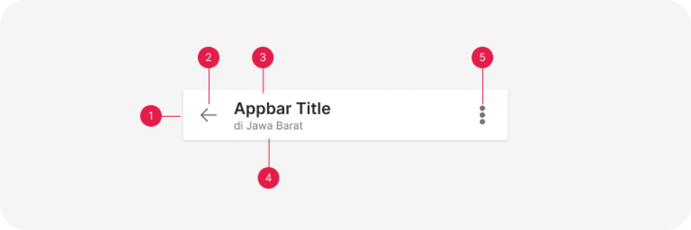
- Container
- Navigation
- Title
- Subtitle (optional)
- Action items (optional)
Usage
A top app bar can transform into a contextual action bar to provide contextual actions to selected items. For example, upon user selection of photos from a gallery, the top app bar transforms to a contextual app bar with actions related to the selected photos. When a top app bar transforms into a contextual action bar, the following changes occur:
- The bar color changes
- Navigation icon is replaced with a close icon
- Top app bar title text converts to contextual action bar text
- Top app bar actions are replaced with contextual actions Upon closing, the contextual action bar transforms back into a top app bar.

Top appbar transforming into a contextual action bar
Behavior
Scrolling
Upon scrolling, the top app bar can remain in place, or transform in the following ways:
- Scrolling upward hides the top app bar
- Scrolling downward reveals the top app bar When the top app bar scrolls, its elevation above other elements becomes apparent.
The top app bar disappears upon scrolling up, and appears upon scrolling down.
Top app bars can be positioned at the same elevation as content. Upon scroll, they increase elevation and let content scroll behind them.